Jun 20, 2010
Global Average Sea Surface Temperatures Continue their Plunge
By Dr. Roy Spencer
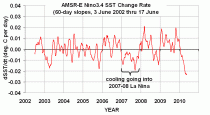
Sea Surface Temperatures (SSTs) measured by the AMSR-E instrument on NASA’s Aqua satellite continue their plunge as a predicted La Nina approaches. The following plot, updated through yesterday (June 17, 2010) shows that the cooling in the Nino34 region in the tropical east Pacific is well ahead of the cooling in the global average SST, something we did not see during the 2007-08 La Nina event (click here for the large, undistorted version):

The rate at which the Nino34 SSTs are falling is particularly striking, as seen in this plot (enlarged here) of the SST change rate for that region:

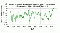
To give some idea of what is causing the global-average SST to fall so rapidly, I came up with an estimate of the change in reflected sunlight (shortwave, or SW flux) using our AMSR-E total integrated cloud water amounts. This was done with a 7+ year comparison of those cloud water estimates to daily global-ocean SW anomalies computed from the CERES radiation budget instrument, also on Aqua (enlarged here):

What this shows is an unusually large increase in reflected sunlight over the last several months, probably due to an increase in low cloud cover.
At this pace of cooling, I suspect that the second half of 2010 could ruin the chances of getting a record high global temperature for this year. Oh, darn.
See post and comments here.
-------------
Warming in Last 50 Years Predicted by Natural Climate Cycles
By Dr. Roy Spencer
One of the main conclusions of the 2007 IPCC report was that the warming over the last 50 years was most likely due to anthropogenic pollution, especially increasing atmospheric CO2 from fossil fuel burning.
But a minority of climate researchers have maintained that some - or even most - of that warming could have been due to natural causes. For instance, the Pacific Decadal Oscillation (PDO) and Atlantic Multi-decadal Oscillation (AMO) are natural modes of climate variability which have similar time scales to warming and cooling periods during the 20th Century. Also, El Nino - which is known to cause global-average warmth - has been more frequent in the last 30 years or so; the Southern Oscillation Index (SOI) is a measure of El Nino and La Nina activity.
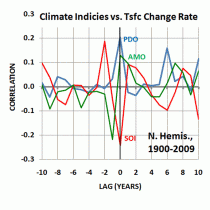
A simple way to examine the possibility that these climate cycles might be involved in the warming over the last 50 years in to do a statistical comparison of the yearly temperature variations versus the PDO, AMO, and SOI yearly values. But of course, correlation does not prove causation (enlarged here).

So, what if we use the statistics BEFORE the last 50 years to come up with a model of temperature variability, and then see if that statistical model can “predict” the strong warming over the most recent 50 year period? That would be much more convincing because, if the relationship between temperature and these 3 climate indicies for the first half of the 20th Century just happened to be accidental, we sure wouldn’t expect it to accidentally predict the strong warming which has occurred in the second half of the 20th Century, would we?
Temperature, or Temperature Change Rate?
This kind of statistical comparison is usually performed with temperature. But there is greater physical justification for using the temperature change rate, instead of temperature. This is because if natural climate cycles are correlated to the time rate of change of temperature, that means they represent heating or cooling influences, such as changes in global cloud cover (albedo).
Such a relationship, shown in the plot below, would provide a causal link of these natural cycles as forcing mechanisms for temperature change, since the peak forcing then precedes the peak temperature.
Predicting Northern Hemispheric Warming Since 1960
Since most of the recent warming has occurred over the Northern Hemisphere, I chose to use the CRUTem3 yearly record of Northern Hemispheric temperature variations for the period 1900 through 2009. From this record I computed the yearly change rates in temperature. I then linearly regressed these 1-year temperature change rates against the yearly average values of the PDO, AMO, and SOI.
I used the period from 1900 through 1960 for “training” to derive this statistical relationship, then applied it to the period 1961 through 2009 to see how well it predicted the yearly temperature change rates for that 50 year period. Then, to get the model-predicted temperatures, I simply added up the temperature change rates over time.
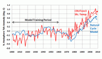
The result of this exercise in shown in the following plot (enlarged here).

What is rather amazing is that the rate of observed warming of the Northern Hemisphere since the 1970’s matches that which the PDO, AMO, and SOI together predict, based upon those natural cycles PREVIOUS relationships to the temperature change rate (prior to 1960).
Again I want to emphasize that my use of the temperature change rate, rather than temperature, as the predicted variable is based upon the expectation that these natural modes of climate variability represent forcing mechanisms - I believe through changes in cloud cover - which then cause a lagged temperature response.
This is powerful evidence that most of the warming that the IPCC has attributed to human activities over the last 50 years could simply be due to natural, internal variability in the climate system. If true, this would also mean that (1) the climate system is much less sensitive to the CO2 content of the atmosphere than the IPCC claims, and (2) future warming from greenhouse gas emissions will be small.
Jun 18, 2010
Glaciers’ wane not all down to humans
By Quirin Schiermeier, Nature News
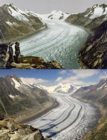
The Great Aletsch Glacier is ill. Over the course of the twentieth century, the largest Alpine glacier, in Valais, Switzerland, receded by more than two kilometres, and Switzerland’s 1,500 smaller glaciers are not faring any better.

The Great Aletsch Glacier lost about 10 km3 of ice between 1890 (top) and 2005 (bottom).Roger Viollet Collection/Getty Images; G. Fischer/Photolibrary
Is it all down to man-made global warming? Not according to a recent study, which finds that about half of the glacier loss in the Swiss Alps is due to natural climate variability1 - a result likely to be true for glaciers around the world.
“This doesn’t question the actuality, and the seriousness, of man-made climate change in any way,” says Matthias Huss, a glaciologist at the University of Fribourg in Switzerland, who led the study. “But what we do see is that current glacier retreat might be equally due to natural climate variations as it is to anthropogenic greenhouse warming.”
“This is the first detailed attribution of known climate forces on glacier behaviour,” says Georg Kaser, a glaciologist at the University of Innsbruck in Austria, who was not involved in the study. “Given the importance of glaciers to local water supply, this is essential information.”
Researchers have long suspected that glaciers respond sensitively to natural climate swings such as those caused by the rhythmic rise and fall of North Atlantic sea surface temperatures by up to 1 C roughly every 60 years. This Atlantic multidecadal oscillation (AMO), driven by changes in ocean circulation, is thought to affect phenomena including Atlantic hurricanes and rainfall in Europe.
“The idea that glacier retreat is the solely due to increased air temperature is overly simplistic.” In most places, historical records of glacier retreat and local climate are too sparse for researchers to separate the effect of this natural cycle from that of man-made warming. In the relatively well-monitored Swiss Alps, however, Huss and his team managed to gather some 10,000 in situ observations that had been made over the past 100 years, and constructed three-dimensional computer models of 30 glaciers. By comparing a time series of daily melt, snow accumulation and ice and snow volume readings of the glaciers with a widely used index of the AMO, they teased out the impact of natural climate variability. Although the mass balance of individual glaciers varied, the long-term overall trend followed the pulse of the AMO.
Since 1910, the 30 glaciers have lost a total of 13 cubic kilometres of ice - about 50% of their former volume. Brief periods of mass gain during cool AMO phases in the 1910s and late 1970s were outweighed by rapid losses during warm phases in the 1940s and since 1980, when temperatures rose and more precipitation fell as rain than as snow. The scientists believe that these changes are due to the combined effects of the natural cycle and anthropogenic global warming, which now seems to have a greater role than early in the twentieth century.
Subtle mix
Natural climate variability is likely to have driven twentieth-century glacier shrinkage and thinning in other parts of the world, says Kaser. For example, his own research on the glaciers of Mount Kilimanjaro in Tanzania suggests that their dramatic recession is mainly due to multidecadal fluctuations in air moisture2.
“The widespread idea that glacier retreat is the sole consequence of increased air temperature is overly simplistic,” he says. “Glaciologists have known for more than 50 years that glaciers are sensitive to a variety of climate variables, not all of which can be attributed to global warming.”
Questions about the effect of global warming on glaciers hit the headlines earlier this year, after an error was found in the latest assessment report from the Intergovernmental Panel on Climate Change (IPCC), based in Geneva, Switzerland, which wrongly stated that most Himalayan glaciers could disappear by the year 20353. The resulting furore put the IPCC’s credibility under scrutiny, and has triggered an independent review by the InterAcademy Council in Amsterdam, which represents 15 national academies of science.
But scientists don’t expect the latest findings on Swiss glaciers to rekindle the controversy. “Without studies like this, climate science would actually be less credible than it is,” says Martin Beniston, a regional climate modeller at the University of Geneva in Switzerland, who was not involved in the study. “Problems related to global warming are caused by a subtle mix of human activity and natural changes, and these new findings are a rare opportunity to illustrate this complexity in a comprehensible way. It is a question of scientific honesty to admit that not all the effects of climate change are solely the result of increased greenhouse gases.”

Beniston adds that recognizing the role of natural climate shifts doesn’t diminish the problem. “Even if greenhouse gases contribute just 50% to glacier retreat, this is anything but negligible.” Although Himalayan glaciers may not be as vulnerable as the IPCC report originally suggested, the European Alps, where most glaciers are already in decline, could lose up to 90% of their glaciers by the end of the century, says Kaser.
The authors of the latest study cautiously suggest that a phase shift in the AMO might give a reprieve to Great Aletsch and other Alpine glaciers in the next decades, but Beniston is doubtful. “We may see a temporary slowdown, but I fear in the long run the still fairly modest greenhouse effect will outweigh any Atlantic relief.”
References:
1. Huss, M., Hock, R., Bauder, A. & Funk, M. Geophys. Res. Lett. 37, L10501 (2010). Article
2. Kaser, G., Hardy, D. R., Molg, T., Bradley, R. S. & Hyera, T. M. Int. J. Climatol. 24, 329-339 (2004). Article
3. Schiermeier, Q. Nature 463, 276-277 (2010). Article
Update: See the link of the glaciers to AMO in the paper 100-year mass changes in the Swiss Alps linked to the Atlantic Multidecadal Oscillation here.
Jun 18, 2010
Guest Post By Bruce Hall on Climate Science Weblog on Temperature Extremes
By Bruce Hall, Climate Science Weblog
Dr. Pielke has kindly offered me the opportunity to address a basic issue regarding the difficulty in holding meaningful discussions with regard to climate change based on an email exchange I had with a person who agreed with my conclusions, but was uncomfortable with my methodology.
The following statement was part of a recent email I received:
I have just ‘stumbled’ upon your fascinating page and have been reading about the U.S. extreme temperatures. I do not challenge the numbers but I do think their description can be a bit misleading. You list the temperatures as monthly when, in fact, they are single day extremes for a given month. The true monthly temperature extremes (record highs or lows) are the average of the readings taken during a given month. I have downloaded the NCDC-NOAA state-by-state database and the monthly highs and lows are almost always different. Neither figures support a warming in the contiguous US.
Three years ago, I published an analysis of U.S. all-time monthly temperature extremes by state from NOAA data and then updated it again in 2009. This material provides a somewhat different perspective of the U.S. climate over the past 14 decades than popularly shown.
Most of us are comfortable with the idea that average temperatures accurately reflect weather. We like to know that the average normal for July is 74 and for January it is 27. It gives us a sense of understand. The idea of using extremes as a measure makes us uncomfortable. What do we really learn from a statement that the July high temperature record was 113 and the record low temperature for January was minus 37? In terms of simple expectations, averages are more comfortable than extremes. We can’t plan for extremes. We don’t purchase a wardrobe for extremes.
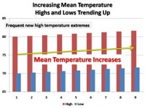
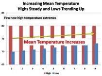
Nevertheless, when it comes to climate, I propose that averages...as we derive them...are fraught with problems, not the least of which is the practice of changing historical data to “fix” changing conditions. An average fails to give insight into variation; what is the temperature range upon which the average is derived? For example, average temperatures could increase in these scenarios (enlarged here and here):


In the case of high and low average temperatures increasing, one would expect to see more frequent high temperature records...a basic assumption of global warming. In the case of only low average temperatures increasing, one might question why. Indeed, Anthony Watts has done an extensive study of weather stations across the United States and concluded that a large part of the problem stems from poor station siting and encroachment of urban areas around weather stations..."lows tonight in the upper 50s...cooler in the outlying areas.”
Certainly some cyclical warming occurred after the 1970s, but the record of new high temperature extremes shows that - whatever the derived averages - there was no significant climate change versus past cyclical warm periods.
My response to the email was:
While I understand how one can find fault with calling the records “monthly” as opposed to daily, the data are for the highest and lowest all-time recorded temperatures for each month for each state since 1880. They are records of extremes as opposed to calculated or derived averages.
While this may not satisfy some, I believe it has specific advantages over averages.
1. The data are not adjusted. They are recognized as valid by NOAA and have not been “corrected” by interpolation with data from other weather station data.
2. They represent the climate “boundaries” for statewide geographies. A record either stands on it’s own or is replaced by a subsequent reading that ties or exceeds it.
3. It allows testing of the tenet that global warming necessarily results it an increased frequency of temperature extremes.
While one can argue that US records are a small fraction of earth’s geography coverage, they represent the most consistent sampling for the past 130 years.
My conclusions from this exercise were that:
1. The last two decades were warm, but not abnormally so.
2. The 1930s were significantly warmer over a wider geography.
3. The last decade was unusually berift of temperature extremes, with low temperature extremes occurring in the NE US.
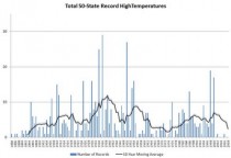
From the January, 2009 update (here):

Jun 16, 2010
Trying to Hit a Mosquito with a Sledgehammer
World Climate Report on the SPPI blog
One of the standard tenets of the global warming bible is that malaria will get worse as temperatures rise. We’ve addressed this many times before, primarily by noting that the link between high temperatures and high malaria infection rates is anything but straightforward. Infectious disease expert Paul Reiter is quick to point out that malaria has been observed inside the Arctic Circle...and this is obviously not typical of a so-called “tropical” disease.
Nevertheless, the case for a malaria-temperature relationship stands on reasonably solid ground. Mosquitoes are more active at higher temperatures so they can expand their range. Biting frequency also depends on temperature, to some extent, so this should increase the infection rate, assuming the little buggers can find enough people to bite. Fairly sophisticated models have been developed that estimate the impact of weather variables on malaria infection rates. On the face of it, this seems like a reasonably solid argument.
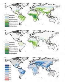
But in a recent paper in Nature, Oxford University’s Peter Gething and colleagues from Oxford and the University of Florida took a careful look at global malaria data to see if the predicted trend was correct. They uncovered data from around the year 1900 showing where malaria was observed. These data not only show where malaria occurred, but also different categories of endemicity (in locations where the disease is continually present, the categories depict the approximate percentage of mosquitoes that carry the malaria parasite). 1900 is a key time because of the lack of prior malaria intervention efforts. The authors then used a current model of the parasite’s transmission to create a map at the same scale for the year 2007. The 1900 and 2007 maps are shown in Figure 1a and 1b, respectively. It’s then a simple matter to subtract the two maps to show how malaria endemicity has changed over the last 100 plus years (in this case, this is a subtraction of categories). This is shown in the bottom Figure (1c), where red shows increasing malaria and blue decreasing malaria.
There is virtually no red on the map.

Figure 1. (enlarged here) Malaria endemicity in 1900 (a, top) and 2007 (b, middle) by increasing severity category. The difference in endemicity (c, bottom) from 1900 to 2007 indicates worsening malaria in red areas and improvements in blue (Gething et al., 2010).
If you give this issue a moment of thought, this result should be obvious. Of course malaria is not as bad now as it was 100 years ago. Global health interventions should have reduced the problem significantly.
But it has also been warming since 1900, including nearly all of the regions were malaria was endemic. Look at the problem this way: if you had available to you a) the current malaria/climate models, b) the 1900 malaria map, and c) a fairly accurate prediction of future temperatures, there is no possible way you would have predicted anything close to the map shown in Figure 1b for 2007. That’s because the climate models do not consider factors other than climate (this is also why heat-related mortality/climate model projections don’t work either).
It’s fair to say that everyone who works on this issue is pleased that malaria is less of a problem now. This speaks to the importance of intervention and awareness programs in fighting transmission. And the trend really shouldn’t be that surprising. But one might argue that regardless of the Gething et al. result, this does not mean that climate is not important.
The key part of the Nature paper, however, is the author’s attempt to quantify the effect of climate compared to other factors. To estimate these, they calculated something called the “basic reproductive number” of the malaria parasite (this is a measure of how efficiently the disease spreads within a population that has no inherent resistance to it). Even though the exact reproductive number is hard to predict, you can estimate the magnitude of the changes (also called the “effect size") that might arise from different factors, such as climate or intervention programs.
Climate projections vary, of course, depending on the models and assumptions used, but the maximum effect sizes for the year 2050 arising from climate changes are around 2 or 3 (a doubling or trebling of the reproductive number). By comparison, the observed changes in effect size (between 1900 and 2007) were much greater than the projected climate change impact. More specifically, Gething et al.
...found that, of the 66 million km2 of the Earth’s surface thought to have sustained stable/endemic malaria in 1900, 12%, 18% and 57% had exhibited proportional decreases in the reproductive number of up to one, between one and two, and greater than two orders of magnitude, respectively; 11% had shown no evidence of change; and 2% had shown evidence of an increase in the reproductive number by 2007. Although imperfect, this simple comparison illustrates that despite warming global temperatures, the combined natural and anthropogenic forces acting on the disease throughout the twentieth century have resulted in the great majority of locations undergoing a net reduction in transmission between one and three orders of magnitude [emphasis added, Eds.] larger than the maximum future increases proposed under temperature-based climate change scenarios...When compared to the substantially smaller proposed magnitude of climate-induced effects, an important and simple inference is that [climate change impacts] can be offset by moderate increases in coverage levels of currently available interventions.
In other words, if we are really interested in stopping the spread of malaria, there are more effective ways of dealing with it than undertaking draconian global legislative efforts to reduce greenhouse gas levels - the equivalent of pummeling a mosquito with a sledgehammer.
Reference:
Gething, P.W., Smith, D.L., Patil, A.P., Tatem, A.J., Snow, R.W. and S.I. Hay, 2010. Climate Change and the Global Malaria Recession. Nature, 465, 342-346
Jun 15, 2010
Seeking Support Based on Failure
By Paul Chesser
Over the weekend the New York Times reported about several Green adherents to the Rahm Emanuel call to “never let a serious crisis go to waste:”
The oil spill spreading through the Gulf of Mexico has been declared the worst environmental catastrophe ever in the United States. But for American environmentalists, the distress may also bring opportunity....
Environmentalists, for their part, are hoping that the country will pay more attention to green issues after seeing the devastation in the gulf. Already, groups are using the spill as a rallying cry. Luke Metzger, the director of Environment Texas, said that his group’s canvassers had switched their fund-raising and petitions pitch from aiding a remote mountain range to urging an end to new offshore drilling....
Another environmental group, American Rivers, is anticipating more attention to wetlands issues in general, even though oil was spilled into the sea, not rivers. “People are simply more tuned into environmental issues right now, especially when it comes to clean water,” said Amy Souers Kober, a spokeswoman for the group.
This is rich. Interior Secretary Ken Salazar just canned Liz Birnbaum, the director of the agency responsible for the oversight of oil drilling in federal waters, the Minerals Management Service. She was allegedly found to be incompetent because those who rewrite history in the Obama administration want the public to believe she was tasked with cleaning house at the corrupt MMS, but in reality she was told her top goal was to push alternative energy initiatives like the Cape Wind project.
There was little on Birnbaum’s bio that demonstrated she was up to the job. Before that she was staff director for the Committee on House Administration, but her most extensive recent experience that apparently qualified her to lead MMS was her position as a lobbyist and general counsel for...American Rivers! Now they are trying cultivate support based upon a disaster that happened on her watch.
Like I said—rich. See post here. See how Obama will use Oval Office speech to politicize the Gulf oil disaster here.
----------------
BP’s Dismal Safety Record
By Pierre Thomas, Lisa A. Jones, Jack Cloherty and Jason Ryan
As the nation comes to grips with the worst oil disaster in its history, there is evidence BP has one of the worst safety track records of any major oil company operating in the United States.
In two separate disasters prior to the Gulf oil rig explosion, 30 BP workers have been killed, and more than 200 seriously injured. In the last five years, investigators found, BP has admitted to breaking U.S. environmental and safety laws and committing outright fraud. BP paid $373 million in fines to avoid prosecution.
BP’s safety violations far outstrip its fellow oil companies. According to the Center for Public Integrity, in the last three years, BP refineries in Ohio and Texas have accounted for 97 percent of the “egregious, willful” violations handed out by the Occupational Safety and Health Administration (OSHA).
The violations are determined when an employer demonstrated either an “intentional disregard for the requirements of the [law], or showed plain indifference to employee safety and health.” OSHA statistics show BP ran up 760 “egregious, willful” safety violations, while Sunoco and Conoco-Phillips each had eight, Citgo had two and Exxon had one comparable citation.
Failure to Act
After a 2005 BP refinery explosion in Texas City, Texas that killed 15 people and injured 180, a Justice Department investigation found that the explosion was caused by “improperly released vapor and liquid.” Several procedures required by the Clean Air Act to reduce the possibility of just such an explosion either were not followed, or had not been established in the first place.
BP admitted that its written procedures to ensure its equipment’s safety were inadequate, and that it had failed to inform employees of known fire and explosion risks. The company paid $50 million in criminal fines in connection with that disaster, and acknowledged violating the Clean Air Act. Jordan Barab, the deputy assistant secretary of Labor for OSHA, said BP refineries have a “systemic safety problem,” and that the tragedy in BP-Texas City “revealed serious process safety and workplace culture problems at the facility.”
Paying Fines
Yet BP never fixed the problems in Texas City. Just last October, OSHA fined the company $87 million because it has failed to correct the safety problems at the rebuilt Texas City plant. That represented the largest fine in OSHA history. In 2007, a BP pipeline spill poured 200,000 gallons of crude oil into the pristine Alaskan wilderness. In researching the environmental hazard, investigators discovered BP was aware of corrosion along the pipeline where the leak occurred but did not respond appropriately. The company was forced to pay $12 million more in criminal fines for the spill, in addition to another $4 million to the state of Alaska.
Manipulating The Market
BP’s infractions were more than environmental. The Justice Department required the company to pay approximately $353 million as part of an agreement to defer prosecution on charges that the company conspired to manipulate the propane gas market. Investigators from the Justice Department found that some BP traders were stockpiling propane, which forced the market prices to skyrocket. After their incriminating conversations about controlling the market were caught on tape, three BP traders were indicted.
The alleged price gouging affected as many as 7 million propane customers who depended on propane to heat their homes and cost the consumers $53 million. But for a company that reported profits of $14 billion in 2009, the fines represent a small fraction of the cost of doing business.
See post here. See new story on how Documents Show BP Cut Corners in Days Before Blowout here.
BP played a major role in drafting the Kerry-Lieberman bill (here) and when ironically the accident occured was finalist for an award from the Obama administration for their ‘safety record’. The “political stupidity is unbelievable,” Democratic strategist James Carville said on “Good Morning America”. You can’t make this stuff up.
--------------
Some Good News: U.S. Northeast Carbon Permits Draw Record Low Price
By Simon Lomax, Bloomberg
Carbon dioxide permits in the U.S. Northeast’s cap-and-trade program tumbled to a record low price at auction amid a surplus of the pollution rights and doubts that Congress will create a national emissions market this year.
The Regional Greenhouse Gas Initiative sold 40.7 million permits for $1.88 each, 19 cents lower than the last auction held in March and 2 cents above the minimum allowable bid, the cap-and-trade program said on its website today. Each permit in the carbon trading program for power plants from Maryland to Maine represents one ton of carbon dioxide.
Those permits come from the regional carbon trading program’s first phase, or “control period,” from 2009 to 2011. This week’s auction, held June 9 with the results withheld until today, also offered 2.14 million permits from the 2012-to-2014 control period. They went for $1.86.
“Prices are a lot lower than expected,” Tim Cheung, an analyst with Bloomberg New Energy Finance in New York, said in a telephone interview. “Demand for power hasn’t increased with the economic recovery and that means there’s an oversupply of permits in the market.”
Permit Surplus
The surplus of permits, also called allowances, is due to the gap between actual carbon dioxide output from power plants and the number of permits being issued by the Northeast states. The states decided in 2005 how many permits to issue and left room for emissions to rise before the 2009 start of the cap-and- trade program. Instead, emissions fell as the economy slowed.
The auction price for permits peaked at $3.51 in March 2009 as Democrats in the U.S. House were preparing federal cap-and- trade legislation that would suspend the Northeastern market and convert its surplus permits into federal allowances.
Speculation that Northeastern pollution permits could be converted into federal allowances drew “financial players” such as banks and hedge funds into the Northeastern carbon market, Paul Tesoriero, director of environmental trading at Evolution Markets LLC in White Plains, New York, said in a telephone interview.
When the cap-and-trade legislation narrowly passed the House and stalled in the Senate, those “high hopes” faded and “you’re seeing the financial players not participating” in the market alongside the power plants that have to buy the carbon dioxide permits to keep running, Tesoriero said. “If there was another layer of financial players, there’d be more demand in the market,” he said.
With the “low probability” of Congress enacting a federal cap-and-trade market for carbon dioxide this year, prices are falling closer to $1.86 faster than expected, he said. “Everyone in the market knows this thing is heading to $1.86; its just when are we going to get there.” In secondary market trading, December-delivered permits fell 10 cents, or 4.9 percent, to a record low of $1.96 each on the Chicago Climate Futures Exchange. See the story here.
|

