


By Noel Sheppard, Newsbusters
Climate Progress’s Joe Romm (“Climate astrologist”) believes global warming caused all the rain at last week’s U.S. Open golf tournament, and because favorite Tiger Woods was in the first draw of players most impacted by the inclement weather, it cost him the victory.
In his latest exhibition of Global Warming Derangement Syndrome, Romm conveniently ignored how New York is currently experiencing one of its coldest Junes on record. Alas, as we’ve seen from Romm and his ilk in the past, facts are often inconvenient truths to be summarily cast aside when they conflict with the agenda (h/t Climate Depot):
And yes, Tiger Woods lost, even though I called him an “all-climate player” after he won “the brown British Open” at drought-stricken Royal Liverpool in 2006 and the “Hottest Major of All Time.” In fact, I had predicted “No doubt he’ll some day win the ‘wettest major of all time,’ too” - but a bad draw and bad putting thwarted him, as I’ll discuss at the end. [...]
I’m going to borrow and modify a term from the scientific literature and call this a “global-warming-type” deluge - see Must-have PPT: The ”global-change-type drought” and the future of extreme weather. After all, this type of extreme downpour is precisely what climate science projects would happen when you put more water vapor into the air. And it is precisely what major peer-reviewed studies have shown the United States has been experiencing in the past few decades (see Why the “never seen before” Fargo flooding is just what you’d expect from global warming, as Obama warns): [sic]
Yes, but New York and the northeast are experiencing a very cold June. As Bloomberg reported days before the tournament started:
The average temperature from June 1 through yesterday was 65.2 degrees Fahrenheit (18.4 Celsius), or 4.1 degrees below normal, said Richard Castro, a student forecaster at the Upton office. The coldest June in Central Park was in 1903, with an average temperature of 64.2 degrees, and the wettest was in 2003, with 10.27 inches of rain, Castro said. This month is currently tied for the second-coldest, in 1881. Castro said that could change because there are still 6 days left before July. “We stand a good chance to be in the top-10 coldest Junes,” Castro said by telephone.
On Thursday, Weather Underground reported (h/t Marc Sheppard): Through June 24… the average monthly temperature is 66.1 degrees… 4.4 degrees below normal. [...] So far… this June has been the fourth coldest June on record at Central Park.
So, global warming is causing wetter, cooler summer conditions? If that’s the case, how’s all that ice going to melt to cause sea levels to rise and drown everyone living on the coasts?
Maybe more importantly, is this why the Orlando Magic surprisingly beat LeBron James and the Cleveland Cavaliers earlier in the month? With all the things these alarmists claim are caused by global warming, it wouldn’t be at all surprising. Read Noel’s post here.
Icecap Note: It has been even colder further east. Boston as of June 25th was running 4.6F below normal and parts of the Cape more than 5 degrees colder than a normal June. The northeast is enjoying a summer very like the United Kingdom had last year, cool and wet. Though heat has been intense at times in the south central states, it has also been unusually mild in the desert southwest in June. there Phoenix had 15 straight days with highs below 100F for the first time since 1913, the only year in the past century with more sunspotless days than 2008. Coincidence? Another manifestation of global warming? Joe Romm was laughingly hoping for big time heat in the east during the battle on cap-and-trade. the only heat will be that behind the scene put on the congress to do the bidding of the administration.
By Anthony Watts, Watts Up With That
UPDATE: The “ghost author” has been identified, see the end of the article. When I first saw it, I laughed. When I saw the internal memo circulated to top managers at NOAA, I laughed even more. Why? Because NOAA and NCDC are rebuking an analysis which I have not even written yet, using old data, and nobody at NOAA or NCDC had the professionalism to put their name to the document.
First let’s have a look at the National Climatic Data Center’s web page from a week ago:
I was quite surprised to find that my midterm census report on the surfacestations.org project evoked a response from NCDC. I suppose they are getting some heat from the citizenry and some congress critters over lack of quality control. I was even more surprised to see that they couldn’t even get the title right, particularly since the title of my report defines most of what NCDC is all about; Surface Temperature Measurement.
Here’s the title of my report released in March. “Is The U.S. Surface Temperature Record Reliable?”
But NCDC calls it: “Is the U.S. Temperature Record Reliable?” True, a small omission, the word “surface”. But remember, this is a scientific organization that writes papers for peer reviewed journals, where accuracy in citation is a job requirement. Plus, the director of NCDC is Thomas Karl, who is now president of the American Meteorological Society. The Bulletin of the American Meteorological Society is considered a premiere peer reviewed journal, and Karl has written several articles. For him to allow a botched citation like this is pretty embarrassing. [NOTE: For those that just want to read my report, please feel free to download and read the free copy here PDF, 4 MB]
But the citation error is not just in the NCDC webpage, it is in the PDF document that NOAA and/or NCDC wrote up. I can’t be sure since they cite no named author. I had few people point out the existence of the NCDC rebuttal to me in the last week, and I’ve been biding my time. I wanted to see what they’d do with it. Over the weekend I discovered that NOAA had widely circulated NCDC’s “talking points” document to top level division managers in NOAA. I was given this actual internal email, by someone whom appears not to agree with the current NOAA/NCDC thinking.
It seems pretty much everyone in management at NOAA got this email, yet a week later the citation error remains. Nobody caught it. I find it pretty humorous that NOAA felt that a booklet full of photographs that many said at the beginning “don’t matter” required an organization wide notice of rebuttal. Note also some big names there. Senior NOAA scientist Susan (1000 year CO2) Solomon got a copy. So did Matt Ocana, Western Region public affairs officer for the National Weather Service. Along with Jeff Zimmerman who appears to be with the NWS Southern Region HQ. The originator, Andrea Bair, is the Climate Services Program Manager, NWS Western Region HQ.
There are lots of other curious things about that NCDC “Talking Points” document.
1. They give no author for the talking points memo. An inquiry as to the author’s name I sent to my regular contact at NCDC a week ago when I first learned of this has gone unanswered. Usually I have gotten answers in a day.
2. They think they have the current data, they do not. They have data from when the network was about 40% surveyed. They cite 70 CRN1/2 stations when we actually have 92 now. Additionally, some of the ratings have been changed as new/better survey information has come to light. They did their talking points analysis with old data and apparently didn’t know it.
3. They never asked me for a current data set. They know how to contact me, in fact they invited me to give a presentation at NCDC last year, which you can read about here in part 1 and part 2
Normally when a scientific organization prepares a rebuttal, it is standard practice to at least ask the keeper of the data if they have the most current data set, and if any caveats or updates exist, and to make the person aware of the issues so that questions can be answered. I received no questions, no request for data and no notice of any kind. This is not unlike NCDC’s absurd closing of my access to parts of their station meta database in the summer of 2007 without notice just a few weeks after I started the project.
4. They cite USHCN2 data in their graph, but they can’t even get the the number of stations correct in USHCN2. The correct number from their AMS publication is 1218 stations, they list 1228 on the graph. While the error is a simple one, it shows the person doing the talking points was probably not fully familiar with the USHCN2.
When I was invited to speak at NCDC last year, I had a lengthy conversation with Matt Mennes, the lead author of the USHCN2 method and peer reviewed paper here. What I learned was this:
a) The USHCN2 is designed to catch station moves and other discontinuities. Such as we see in Lampasas, TX
b) It will NOT catch long term trend issues, like UHI encroachment. Low frequency/long period biases pass unobstructed/undetected. Thus a station that started out well sited, but has had concrete and asphalt built up around it over time (such as the poster child for badly sited stations Marysville, now closed by NOAA just 3 months after I made the world aware of it) would not be corrected or even noted in USHCN2.
5. They give no methodology or provenance for the data shown in their graph. For all I know, they could be comparing homogenized data from CRN1 and 2 (best stations) to homogenized data from CRN 345 (the worst stations), which of course would show nearly no difference. Our study is focusing on the raw data and the differences that changes after adjustments are applied by NCDC. Did they use 1228 stations or 1218 ? Who knows? There’s no work shown. You can’t even get away with not showing your work in high school algebra class. WUWT? For NCDC not to cite the data and methodology for the graph is simply sloppy “public relations” driven science. But most importantly, it does not tell the story accurately. It is useful to me however, because it demonstrates what a simple analysis produces.
6. They cite 100 year trends in the data/graph they present. However, our survey most certainly cannot account for changes to the station locations or station siting quality any further back than about 30 years. By NCDC’s own admission, (see Quality Control of pre-1948 Cooperative Observer Network Data PDF) they have little or no metadata posted on station siting much further back than about 1948 on their MMS metadatabase. Further, as we’ve shown time and again, siting is not very static over time. More on the metadata issue here.
While we have examined 100 year trends also, our study focus is different in time scale and in scope. If I were to claim that the surfacestations.org survey represented siting conditions at a weather station 50 or 100 years ago, without supporting metadata or photographs, I would be roundly criticized by the scientific community, and rightly so. We believe most of the effect has occurred in the last 30 years, much of it due to the introducing of the MMTS electronic thermometer into the network about 1985 with a gradual replacement since then. The cable issue has forced official temperature sensors closer to buildings and human habitation with that gradual change. NCDC’s new USHCN2 method will not detect this long period signal change introduced by the gradual introduction of the MMTS electronic thermometer, nor do they even address the issue in their talking points, which is central to the surfacestations project.
7. In the references section they don’t even cite my publication! Yet they cite Mennes USHCN2 publication where the 1218 USHCN2 station number is clearly found.
It seems as if this was a rush job, and in the process mistakes were made and common courtesy was tossed aside. I suppose I shouldn’t be upset at the backlash, after all bureaucrats don’t like to be embarrassed by people like me when it is pointed out what a lousy job has been done at temperature measurement nationwide. I’m working on a data analysis publication with authors that have published in peer reviewed climate an meteorology journals. After learning from John V’s crash analysis in summer 2007 when we had about 30% of the network done, few CRN1/2 stations, and poor spatial distribution that people would try to analyze incomplete data anyway, I’ve kept the rating data and other data gathered private until such time a full analysis and publication can be written.
As NCDC demonstrated, it seems many people just aren’t willing to wait or to even respect he right to first publication of data analysis by the primary researcher. By not even so much as giving me a courtesy notice or even requesting up to date data, it is clear to me that they don’t think I’m worthy of professional courtesy, yet they’ll gladly publish error laden and incomplete conclusions written by a ghost writer in an attempt to disparage my work before I’ve even had a chance to finish it. This is the face of NCDC today.
UPDATE: WUWT commenter Scott Finegan notes that Adobe PDF files have a “properties” section, and that the authors name was revealed there. Here is a screencap.
By Maggie Koerth-Baker in National Geographic
What happens when carbon dioxide levels skyrocket? Most climate scientists think they know the answer: global warming.
But to determine just how high temperatures may climb and how climate patterns may shift, researchers may need to pinpoint, for comparison, a time in our planet’s past when a similar carbon dioxide jump happened.
“We really don’t know how high CO2 has been in the geologic past. Thus we don’t know how sensitive the surface temperature of the Earth is to CO2,” said Don DePaolo, head of the Earth Sciences Division at the Lawrence Berkley National Laboratory in California.
Most global warming predictions are based on fluctuations in CO2 levels and temperature that happened between a relatively recent series of ice ages, said DePaolo, who was not involved in the new study, which will appear in tomorrow’s issue of the journal Science.
Chemicals in ice cores, for example, can show how CO2 levels have changed over time, down to five-year intervals.
But ice core records only go back about 800,000 years. By studying chemicals in long-dead, single-celled plankton called foraminifera, though, the team behind the new study was able to extend the climate record back 2.1 million years (prehistoric time line). The method doesn’t provide as much detail, but it does give a pretty clear picture of what was going on at roughly thousand-year intervals.
Carbon dioxide, or CO2, is a naturally occurring greenhouse gas that is also released into the atmosphere by the burning of fossil fuels, for example in cars and power plants (causes of global warming).
“We really don’t know how high CO2 has been in the geologic past. Thus we don’t know how sensitive the surface temperature of the Earth is to CO2,” said Don DePaolo, head of the Earth Sciences Division at the Lawrence Berkley National Laboratory in California. Most global warming predictions are based on fluctuations in CO2 levels and temperature that happened between a relatively recent series of ice ages, said DePaolo, who was not involved in the new study, which will appear in tomorrow’s issue of the journal Science.
Chemicals in ice cores, for example, can show how CO2 levels have changed over time, down to five-year intervals. But ice core records only go back about 800,000 years. By studying chemicals in long-dead, single-celled plankton called foraminifera, though, the team behind the new study was able to extend the climate record back 2.1 million years (prehistoric time line). The method doesn’t provide as much detail, but it does give a pretty clear picture of what was going on at roughly thousand-year intervals. Read more here.
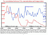
Icecap Notes: There is other evidence that CO2 is actually lower than most of historic times (larger image here).
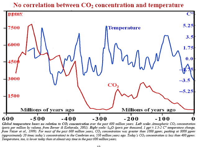
and that it lagged behind the temperature (averaged over numerous Milankovitch cycles) not led the temperature as shown here.
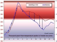
See large image here
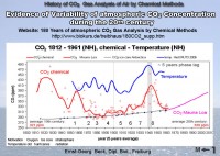
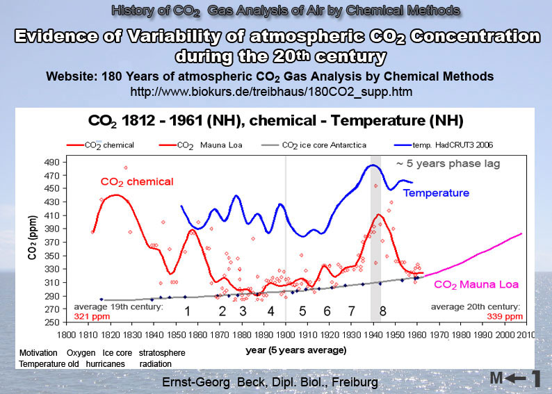
See also There is No Evidence by David Evans here, CO2 the Houdini of Gases by Alan Siddons here, and The Sun Heats the Earth by Hans Schreuder here and the True Levels of CO2? by Ernst George-Beck here in which hew shows actual chemical measurements suggest current levels may have been exceeded even in the last two centuries.
See large image here
As far as I am concerned the true facts as even hinted by the authors in the National Geographic are not well established and can offer little support for any ‘proof’ of CO2 is even a minor driver of climate change. There is no single paper that proves the connection from first principles. Only the coincidental rise of CO2 and temperatures from 1979 to 1998. All of this house of cards is based on the 19th century work of Arrhenius, who later in life, called in question his own early calculations and of course the failing climate models. This last week, Gavin Schmidt of Real Climate noted there would be fewer posts as they were scurrying around to put together a reasonably workable model for IPCC 2010 scenarios. Does that sound like they have the modeling perfected as they and other have claimed?
Along the same lines, Richard Mackey notes “Easterling, D R and Wehner, M P. “Is the climate warming or cooling” Geophysical Research Letters Vol 36 L08706, doi:10.1029/2009GL037810,2009, published 25 April 2009, the Abstract of which reads:
“Numerous websites, blogs and articles in the media have claimed that the climate is no longer warming, and is now cooling. Here we show that periods of no trend or even cooling ofthe globally averaged surface air temperature are found in the last 34 years of the observed record, and in climate model simulations of the 20th and 21st century forced with increasing greenhouse gases. We show that the climate over the 21st century can and likely will produce periods of a decade or two where the globally averaged surface air temperature shows no trend or even slight cooling in the presence of longer-term warming.” They also note “...cooling is a symptom of warming”.
The GCMs don’t predict the periodicities caused by the atmospheric/ oceanic oscillations like ENSO, PDO, IOD, NAO, etc. As the paper argues, if there is a long term upward trend, it can readily be compatible with these momentary mini-troughs of coolness. So the occurance of recent cooling or merely a ceasation of warming doesn’t mean much - if you are an IPCC groupie, even if it means the models aren’t very good.
By Tony B as posted by Jeff Id on Air Vent
There are many great books about heroic polar explorers, and numerous technical papers by arctic researchers-often rather dry. Few papers with a narrative on the scientific exploration of the arctic during the 19th Century seem to exist as a half way house, accesible to laymen and experts alike, so it is hoped this article may fill a gap.
It was always intended to exist electronically, so links to the relevant information source have been made, rather than citing a printed reference. Whilst generally the narrative can be followed without needing to click on the link, many are interesting in their own right and are often well worth a diversion, (but don’t forget to come back.)
Few external ‘official instrumental’ records exist for this period-or are sporadic in area or time scale- so observations made at the time and place are important to our understanding as to what happened to arctic ice and temperatures in this era. This article has two converging themes; the search for the North West passage and the scientific explorations of the region by a former whaler.
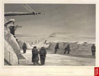
This is somewhat longer than most blog articles, in fact-in truth- it is a a bit of an epic. So close the curtains, turn off the mobile, feed the dog, grab a drink, and order in the pizza for about an hour. Then sit back as the story begins in 1817 when the Royal Society used the enormous resources at their disposal to investigate the claim that THE ARCTIC IS MELTING.
Northwest Passage Attempt 1821
“It will without doubt have come to your Lordship’s knowledge that a considerable change of climate, inexplicable at present to us, must have taken place in the Circumpolar Regions, by which the severity of the cold that has for centuries past enclosed the seas in the high northern latitudes in an impenetrable barrier of ice has been during the last two years, greatly abated…
... this affords ample proof that new sources of warmth have been opened and give us leave to hope that the Arctic Seas may at this time be more accessible than they have been for centuries past, and that discoveries may now be made in them not only interesting to the advancement of science but also to the future intercourse of mankind and the commerce of distant nations.” A request was made for the Royal Society to assemble an expedition to go and investigate. President of the Royal Society, London, to the Admiralty, 20th November, 1817, Minutes of Council, Volume 8. pp.149-153, Royal Society, London. 20th November, 1817 (from John Daly). The quote from the Royal Society is fairly well known, however it is only part of the extract. The missing part - heralded the start of modern arctic science.
Sir Joseph Banks, President of the Royal Society had been particularly interested in reports about ‘unprecedented break up of sea ice at Greenland’ in 1815.’ “Whalers in the North Atlantic in 1815 and 1816 described an unprecedented breaking up of the ice in the Davis Strait, that had apparently sent icebergs as far south as 40°N. The prevailing theory held that seawater could not turn to ice (supported by observations that melted icebergs released fresh water), and therefore that all Arctic ice formed around coastlines. It further held that the waters around the North Pole might therefore be ice-free, forming an Open Polar Sea. If the barriers of ice surrounding this open sea were breaking up, then there might be an opportunity to sail across the top of the North American continent, either by by the proposed Northwest Passage, or perhaps by sailing north past Spitzbergen, across the Polar Sea, and down through the Bering Strait.”
This illustration of arctic Sea Islands comes from 1818. “Passage Through the Ice, June 16, 1818 Lat. 70.44 N” by Sir John Ross, 1819 Princeton Edu.
When Sir Joseph Banks received additional information from the trusted source of young Mr Scoresby during 1817, that must have convinced him that something extraordinary was happening, and he facilitated the resources of the British Admiralty to investigate.
Read the long full post here.
Claim again: Greenland Ice Sheet Melting Faster Again
By Joseph D’Aleo, CCM, AMS Fellow
In the latest edition of Romm’s Fairy Tales on Climate Progress, Joe Romm tries to build a case that sea level rise which has been decelerating in recent years really will be a problem. In the story he warns total sea level rise for the east coast by 2100 could reach 6 feet. He even uses the MIT’s silly and widely scorned wheel of misfortune probability forecasts to bolster his case.
THE REAL STORY
The described changes in Greenland are not at all unprecedented nor are they as described. Many peer review papers support interaction with the Atlantic multidecadal cycles and other factors not greenhouse warming are the real drivers.
Changes to temperature and ice happen predictably every 60 years or so and is in fact entirely natural, related to multidecadal ocean cycles. Multidecadal cyclical warming was observed before in the 1800s and middle 1900s long before the industrial revolution. Also there is more recent evidence showing the idea of lubrication by melt water accelerating loss of glacial or icecap ice is not valid.
Most recently a study by van de Waal in Science showed as the New Scientist reported that “Much noise has been made about how water lubricates the base of Greenland’s ice sheet, accelerating its slide into the oceans. In a rare “good news” announcement, climatologists now say the ice may not be in such a hurry to throw itself into the water after all. Mother Nature, it seems, has given it brakes.
Since 1991, the western edge of Greenland’s ice sheet has actually slowed its ocean-bound progress by 10%, say the team, who have studied the longest available record of ice and water flow in the region.” They looked at how meltwater has correlated with the speed of ice flow at the western edge of the sheet, just north of the Arctic Circle, since 1991. They found that meltwater pouring down holes in the ice called “moulins” did indeed cause ice velocities to skyrocket, from their typical 100m per year to up to 400m per year, within days or weeks. But the acceleration was short-lived, and ice velocities usually returned to normal within a week after the waters began draining. Over the course of the 17 years, the flow of the ice sheet actually decreased slightly, in some parts by as much as 10%.
“For some time, glaciologists believed that more meltwater equaled higher ice speeds,” van de Waal says. “This would be kind of disastrous, but apparently it is not happening.” Van de Waal believes that the channels that carry the meltwater out to sea freeze up during the winter months. In summer, pulses of water rushing down the moulins to the bedrock overwhelm the narrowed channels, and the increased pressure lifts the ice sheet off the rock, enabling it to move faster.
However, after a few days the channels are forced open by the water, and it drains away from the glacier. As a result, the ice grinds back down against the bedrock and the lubricant effect is lost. NO LUBRICATION: Van De Waal says this indicates that, overall, meltwater has a negligible effect on the rate at which the ice sheet moves.”
Other scientists have confirmed that interannual variability is very large, driven mainly by variability in summer melting and sudden glacier accelerations. Consequently, the short time interval covered by instrumental data is of concern in separating fluctuations from trends. But in a paper published in Science in February 2007, Dr. Ian Howat of the University of Washington reports that two of the largest glaciers have suddenly slowed, bringing the rate of melting last year down to near the previous rate. At one glacier, Kangerdlugssuaq, “average thinning over the glacier during the summer of 2006 declined to near zero, with some apparent thickening in areas on the main trunk.”
Dr. Howat in a follow-up interview with the New York Times went on to add “Greenland was about as warm or warmer in the 1930’s and 40’s, and many of the glaciers were smaller than they are now. This was a period of rapid glacier shrinkage world-wide, followed by at least partial re-expansion during a colder period from the 1950’s to the 1980’s. Of course, we don’t know very much about how the glacier dynamics changed then because we didn’t have satellites to observe it. However, it does suggest that large variations in ice sheet dynamics can occur from natural climate variability.”
Thomas, et al. (2000) showed great variance in mass balance of the Greenland ice sheet with highly variable thickening and thinning depending on location. This February (2008) during a bitter cold winter, Denmark’s Meteorological Institute stated that the ice between Canada and southwest Greenland reached its greatest extent in 15 years.
Temperatures were warmer in the 1930s and 1940s in Greenland. They cooled back to the levels of the 1880s by the 1980s and 1990s. In a GRL paper in 2003, Hanna and Cappelen showed a significant cooling trend for eight stations in coastal southern Greenland from 1958 to 2001 (-1.29C for the 44 years). The temperature trend represented a strong negative correlation with increasing CO2 levels.
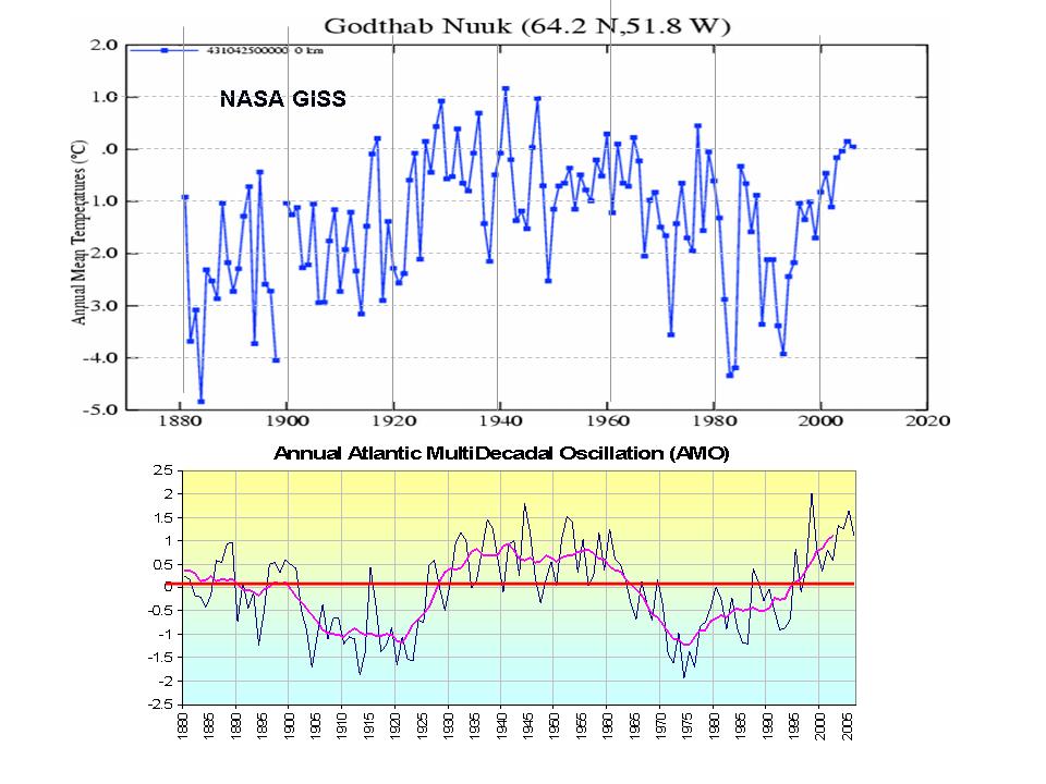
Shown below, see the temperature plot for Godthab Nuuk in southwest Greenland. Note how closely the temperatures track with the AMO (which is a measure of the Atlantic temperatures 0 to 70N). It shows that cooling from the late 1950s to the late 1990s even as greenhouse gases rose steadily, a negative correlation over almost 5 decades. The rise after the middle 1990s was due to the flip of the AMO into its warm phase. They have not yet reached the level of the 1930s and 1940s.
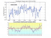
Large image here.
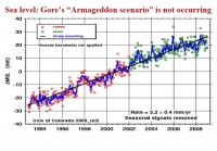
There are numerous recent peer review papers and a satellite data set that finds this is not true and in fact that the sea level rises have slowed in recent decades, most dramatically in the past few years as the oceans have cooled and contracted.
Holgate (2007) calculated that the mean rate of global sea level rise was “larger in the early part of the last century (2.03 plus or minus 0.35 mm/yr 1904-1953), in comparison with the latter part (1.45 plus or minus 0.34 mm/yr 1954-2003).” Idso noted with respect to the Holgate study “the century-long sea level history portrayed in the figure below is suggested by the blue curve we have fit to it, which indicates that mean global sea level may have been rising, in the mean, ever more slowly with the passage of time throughout the entire last hundred years, with a possible acceleration of that (declining) trend over the last few decades.”
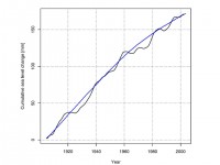
See larger graph here.
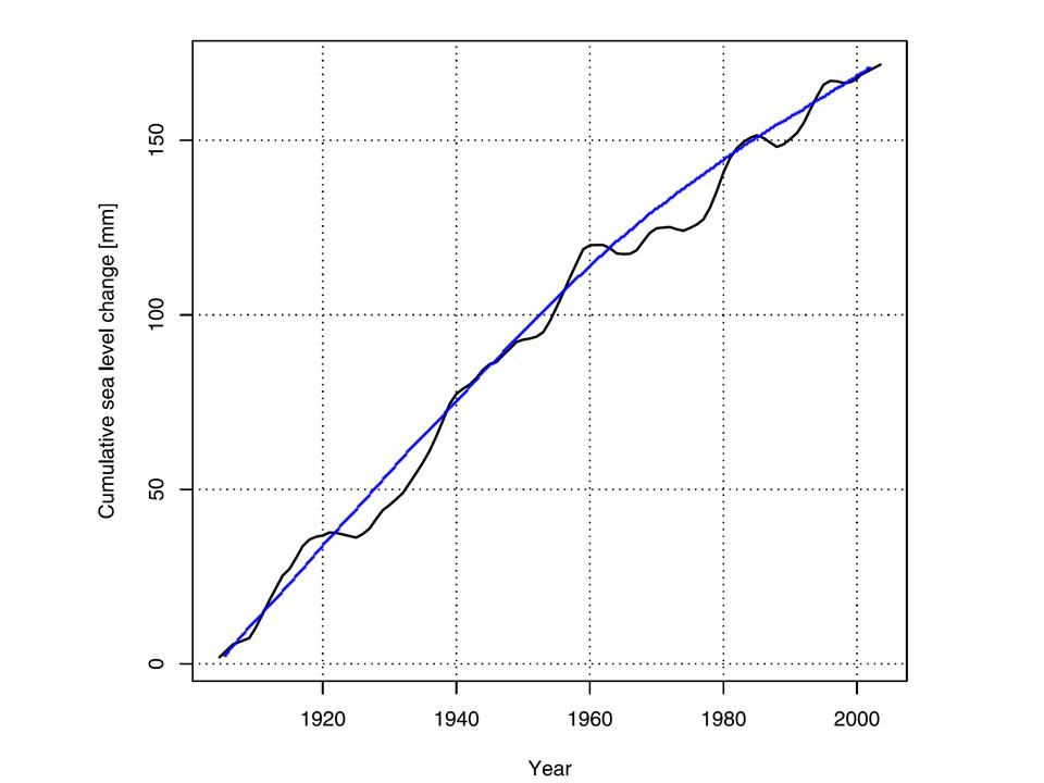
This is supported also by the sea levels as measured by Jason TOPEX.
Sea larger graph here.
Read full analysis of Greenland and sea level here.
UPDATE: Read this earlier Peter Glover comprehensive recap of the world icecap and glacier situation in the American Thinker here.
NASA, June 17, 2009
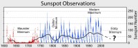
The sun is in the pits of a century-class solar minimum, and sunspots have been puzzlingly scarce for more than two years. Now, for the first time, solar physicists might understand why.
At an American Astronomical Society press conference today in Boulder, Colorado, researchers announced that a jet stream deep inside the sun is migrating slower than usual through the star’s interior, giving rise to the current lack of sunspots.
Rachel Howe and Frank Hill of the National Solar Observatory (NSO) in Tucson, Arizona, used a technique called helioseismology to detect and track the jet stream down to depths of 7,000 km below the surface of the sun. The sun generates new jet streams near its poles every 11 years, they explained to a room full of reporters and fellow scientists. The streams migrate slowly from the poles to the equator and when a jet stream reaches the critical latitude of 22 degrees, new-cycle sunspots begin to appear.
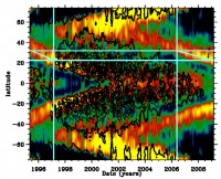
Above: A helioseismic map of the solar interior (large image here). Tilted red-yellow bands trace solar jet streams. Black contours denote sunspot activity. When the jet streams reach a critical latitude around 22 degrees, sunspot activity intensifies. [more graphics]
Howe and Hill found that the stream associated with the next solar cycle has moved sluggishly, taking three years to cover a 10 degree range in latitude compared to only two years for the previous solar cycle.
The jet stream is now, finally, reaching the critical latitude, heralding a return of solar activity in the months and years ahead. “It is exciting to see”, says Hill, “that just as this sluggish stream reaches the usual active latitude of 22 degrees, a year late, we finally begin to see new groups of sunspots emerging.”
The current solar minimum has been so long and deep, it prompted some scientists to speculate that the sun might enter a long period with no sunspot activity at all, akin to the Maunder Minimum of the 17th century. This new result dispells those concerns. The sun’s internal magnetic dynamo is still operating, and the sunspot cycle is not “broken.”
“We still don’t understand exactly how jet streams trigger sunspot production,” says Pesnell. “Nor do we fully understand how the jet streams themselves are generated.”
To solve these mysteries, and others, NASA plans to launch the Solar Dynamics Observatory (SDO) later this year. SDO is equipped with sophisticated helioseismology sensors that will allow it to probe the solar interior better than ever before. Read full release here.
Icecap Note: Solar guru Leif Svalgard in a comment on this release on Watts Up With That notes “This press release is just NASA PR-machine hype. We have not ‘solved’ the problem. Even if we assume that the ‘jetstream’ has anything to do with the generation of spots [and I personally think it is the other way around] we have just moved the problem [rather than solving it] because now the question is “why was it slower?” Furthermore the ‘critical 22 degrees’ is not based on anything other than having happened once before.
What we have is a well-orchestrated CYA attempt: our [i.e. NASA-supported] models [predicting a super-cycle] were thwarted by this strange delay of the oscillation, but are basically correct [I think not].”
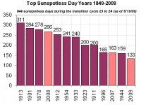
One other note from Icecap: Phoenix has gone 15 days without 100F, the longest stretch in June since 1913, the only year in the last century with more and sunspotless days and the fourth highest sunspotless days since 1849. This year is likely to reach the top 10 also along with 2007 and 2008. Coincidence?
By Art Horn, Meteorologist
Since the fall of 2004 I have been traveling across New England and the Nation with my weather programs. One of these is geared towards the elementary and middle schools. The program “How the Weather Works” is a detailed look at how nature makes the amazing weather around our planet. Near the end of the hour long weather lesson I give the kids an alternative look at the global warming issue. At least alternative compared to what they see on television news programs and so called science shows on cable networks. I’m not only doing this for the students. There are of course teachers in the room. I want them to see this as well so they are always on my mind even though I’m primarily focused on the students. I point out some of the predictions that are made of drastic sea level rises in the future, bigger and more frequent hurricanes and devastating droughts. All of this from global warming cause by humans burning fossil fuels.
One of my big points is that carbon dioxide is not pollution. Without it there is no life on earth. Predictions of how much temperature rise will develop are everywhere. Then I show the students how temperature has changed in the recent 110 years. How at times the temperature has gone up and at times it has gone down. I show the fact that even with carbon dioxide levels increasing there has been no rise in global temperature for 10 years. The next slide is the downward trend in temperature for the last 7 years. Finally we look at how bad the recent forecasts from computer models have been, showing rapid warming by 2009 yet the temperature is going down. Oceans contain more than 1,000 times more heat then the atmosphere and I show the students how warming and cooling of the Pacific Ocean has influenced the changes in the global air temperature. The sun undergoes changes as well and through history a weaker sun has resulted in a cooler earth and a strong sun a warmer earth.
There are many “climate disaster shows” on cable television networks. I warn the kids to be wary of these. They may look and sound real but that is what they are trying to do. These programs use the credibility of a documentary format to “sell” the audience that this is real science. Then the producers of the show add drama and extreme images of disaster to create a feeling of impending doom, all in the name of getting people to watch. My point is that these programs are just television shows, not real science.
The reaction to this by the students is interesting and at times enlightening. Most simply sit there and listen. Some don’t listen at all and can’t wait to get out of the room. A few will have questions but this varies from school to school. Some schools generate many questions. Some of the kids can be quite persistent in asking why I don’t believe Al Gore and his famous movie. A very few kids will even come up to me after the program and continue to ask questions. Some are sure the whole global warming scare is a fake. Others are convinced it’s real. At times I can almost see a parent standing behind a student who is convinced that we are going to ruin the future by burning coal and oil.
What is very interesting is the reaction of the teachers. All of them that care to share their feelings with me after the program are happy that I have given the kids a different point of view. There are probably teachers who don’t want this different opinion to happen but they have never come up to me and said so an I have been in many schools across Connecticut and Massachusetts. The teachers who share their feelings about this may not agree with my opinion all the time but they are willing to hear another side and for this I am encouraged about the future. Children need to know that there are many thousands of real scientists in the United States and around the world who can prove that the burning of fossil fuels influence on climate is so minor as to be insignificant. Our students need education not indoctrination. See PDF.
Icecap Note: Please help us do more of this with our members. Art, an Icecap member has developed much of his own presentation material in part using Icecap. But Icecap has provided powerpoints, graphic and data support, DVDs, and other materials for use by other members, teachers, organizations or interested parties. Art and these volunteer must depend on schools having money in their budgets to cover their costs (time and travel). Your fully tax deductible donation (ICECAP is a C3 tax exempt organization (contact us for details jdaleo@icecap.com) can allow Art and more of our members to bring truth to the classroom or any other organization that has limited budgets. We must expand our reach. If you are interested in learning how to do this in your community, contact us.
By Michael Mogil, CCM
Proponents of anthropogenic (human-caused) climate change have ruled the roost for years. Following the release of the United Nations’ Intergovernmental Panel on Climate Change (IPCC) assessments and Al Gore’s “An Inconvenient Truth” book and movie, the media focused on “impending doom,” shunning skeptics. Only recently have several thousand credible scientists offered organized evidence, research and persuasion that explain how forces far greater than those of mortals are effecting climate change. Their data and explanations indicate that the incredible, soon-to-be-spent megamillions, will have little effect on lowering human-caused carbon-dioxide emissions. On June 2, “Climate Change Reconsidered - The Report of the Non-Intergovernmental Panel on Climate Change (NIPCC)", documenting this scientific evidence, was unveiled at the Third International Conference on Climate Change in Washington, D.C.
We are in a warming period now, but there is no consensus on human causation. Although temperatures have risen over the past five centuries, manifestations of our Industrial Revolution have only been at work for about 200 years. Thus, more than half of the current warming period occurred before humans started overproducing carbon dioxide.
Warming and cooling periods have happened many times over geologic time (about 4.5 billion years). In fact, past temperatures have been warmer than they are today. Since we are talking geologic time, notice how most climate change pronouncements key on “warmest in 30 years” and “strongest hurricane ever.” Yet, true weather records date back only about 60 years for hurricanes and tornadoes. This is due to technological advances like satellites, radars and enhanced communications. For other weather variables, the period of record is usually far less than 100 years. A 30-year period, which defines daily average temperatures, is equivalent to one second now compared to five years geologically.
What drives such changes if humans don’t? Solar output is not constant. We are now in a solar minimum with lower global and regional temperatures. This year, parts of the northern Rockies have experienced late-season snowfalls. The northern tier has had frost risks even into early June. Back in 1816, New England missed summer. Its coldness was linked to volcanic eruptions.
Other contributors to climate change include changes in the Earth’s rotation, slight variances in the tilt of its axis, continental movement, advances and retreats of glaciers (which has happened throughout geologic time), shifts in ecosystem distribution and changes in ocean levels and circulation patterns. In fact, we incorrectly believe that climate is fixed; rather, it is always changing. The Smithsonian’s National Museum of Natural History in Washington showcases such changes over eons. You can also learn about the exhibit here.
While large numbers of record daily high temperatures are still being reported, meteorologist Anthony Watts has questioned the reliability of U.S. temperature records . By photographing and visually inspecting some 850 stations in the U.S. (but extrapolating their findings globally), Watts noted that 89 percent failed to meet even the National Weather Service’s own locating requirements. Many of the stations were “located next to the exhaust fans of air-conditioning units, surrounded by asphalt parking lots and roads, on blistering-hot rooftops, and near sidewalks and buildings that absorb and radiate heat.”
Thus, contrary to claims by the anthropogenic climate change community, there is stark evidence that we are not the culprit. And before we spend “anything that it takes” to solve this now unproven problem, we may want to reassess public opinion. In fact, given that large parts of the world won’t make the changes that the U.S. and Europe are considering, it seems folly to have some nations air condition themselves while others leave the “barn doors open.”
Nonetheless, we must be better stewards of Planet Earth. For any action we take, individuals and families, governments (at all levels) and businesses (large and small) need to look at cost-benefit-risk aspects. Everything needs to be on the table as possible solutions. For decreasing oil usage, I think it is presumptuous to take half of our options off the table while touting only costly-to-produce (but possibly viable) solar, wind and ethanol.
Understanding is crucial if we are to make intelligent choices. Thus, I urge all readers not to blindly accept what I state here. Rather, I hope that you will question your beliefs, statements you may have heard and other aspects of this issue to arrive at your own conclusions. In doing so, you will demonstrate what graces the masthead on these editorial pages, “Give light and the people will find their own way.”
Mogil is a certified consulting meteorologist, retired National Weather Service employee and a longtime weather educator. He also operates the Mathworks Tutoring Center in North Naples. For more information about his perspective of climate change, readers can read his longer article(s) here.
By Anthony Watts
Jack Eddy was a solar scientist who discovered the sunspot period known as “Maunder Minimum” in the 1970’s, and despite intense academic pressure of the current consensus, argued that this demonstrated that our sun was not constant, but indeed a slightly variable star.
See larger image here.
A humble man, he didn’t even name his discovery after himself as some scientists are known to do.
Jack Eddy recently passed away, as announced on WUWT here.

Fellow solar astronomer and friend Dr. Leif Svalgaard announced his plan to present this idea formally in comments there. Icecap note: Also in the following quote Jack Eddy in that second post, summarized his life path and ideals, admirable, especially by today’s lowered standards.
“My reasons for taking this less-traveled road were many. One is the inevitable thrill of discovery when you wander into new areas. More importantly, you also avoid the danger of being too comfortable in too narrow a niche. I truly believe the sayings that there is no hope for the satisfied man and that without fear there is no learning. Entering a new field with a degree in another is not unlike Lewis and Clark walking into the camp of the Mandans. You are not one of them. They distrust you. Your degree means nothing and your name is not recognized. You have to learn it all from scratch, earn their respect, and learn a lot on your own. But I also think that many of the most significant discoveries in science will be found not in but between the rigid boundaries of the disciplines: the terra incognita where much remains to be learned. It’s not a place that’s hidebound by practice and ritual. I have always tried to keep moving between fields of study.” - Jack Eddy, 1999.
Link to sign the petition here.
By Sherwood, Keith and Craig Idso, CO2 Science Magazine
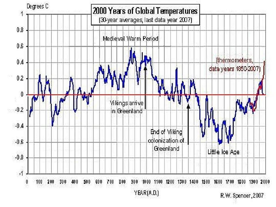
In an important paper recently published in the peer-reviewed journal Climatic Change, Swiss scientists Jan Esper (of the Swiss Federal Research Institute) and David Frank (of the Oeschger Centre for Climate Change Research) take the Intergovernmental Panel on Climate Change (IPCC) to task for concluding in their fourth assessment report (AR4) that, relative to modern times, there was “an increased heterogeneity of climate during medieval times about 1000 years ago.”
This finding, if true, would be of great significance to the ongoing debate over the cause of 20th-century global warming, because, in the words of Esper and Frank, “heterogeneity alone is often used as a distinguishing attribute to contrast with present anthropogenic warming.” On the other hand, if the IPCC’s contention is false, it would mean that the warmth of the Current Warm Period is not materially different from that of the Medieval Warm Period (MWP), suggesting there is no need to invoke anything extraordinary (such as anthropogenic CO2 emissions) as the cause of earth’s current warmth, which does not yet appear to have reached the level experienced a thousand years ago (when there was much less CO2 in the air than there is today), as is indicated by the materials archived in our Medieval Warm Period Project. And, of course, this outcome would also be of great significance.
So what did the two Swiss scientists find? By means of various mathematical procedures and statistical tests, Esper and Frank were able to demonstrate that the records reproduced in the AR4 “do not exhibit systematic changes in coherence, and thus cannot be used as evidence for long-term homogeneity changes.” And even if they could be thus used, they say “there is no increased spread of values during the MWP,” and that the standard error of the component data sets “is actually largest during recent decades.” Consequently, the researchers concluded that their “quantification of proxy data coherence suggests that it was erroneous [for the IPCC] to conclude that the records displayed in AR4 are indicative of a heterogeneous climate during the MWP.”
Nevertheless, the homogeneity issue remains unresolved, for as Esper and Frank also note, “an estimation of long-term spatial homogeneity changes is premature based on the smattering of data currently available.” And that is why we continue to post the results of one new study each and every week that provides additional data on the Medieval Warm Period. We are determined to see this question—and others associated with it—clearly resolved, one way or the other. And as may be seen from the ever-expanding results of our Interactive Map and Time Domain Plot, the MWP is looking ever more global and substantial with every passing week. See magazine here. See interactive map and library of papers here.

Medieval Warm Period. See larger here.
By Jennifer Marohasy, Politics and Environment Blog
In the following open letter to the President of the Australian Academy of Science, William Kininmonth explains that the science of climate change is ‘not settled’ and if the scientific community is to get to a position where it can confidently prediction future climate it will be necessary to both understand why and how the climate system has varied in the past, and to have a robust computer construct of the climate system. Given so far we have neither, the recent very public criticisms of Ian Plimer’s new book ‘Heaven and Earth’ are not logical or consistent.
Dear Professor Lambeck,
I was Interested in your views of Ian Plimer’s book, Heaven and Earth, given in the transcript of your interview on the ABC’s Okham’s Razor. As President of the Australian Academy of Science your opinions carry considerable influence. Based on your own understanding of science and the wide expertise within the Academy that you could draw from I expected a reasoned evaluation, both of the science of climate change and the sociological processes that may have led to the divergent views that exist on the magnitude of human influence. I was disappointed and suspect that many others will have been similarly disappointed.
You certainly set the scene correctly when you stated: “There is no dispute that the geological record shows that climate change has occurred throughout the earth’s history. The dispute is over whether the modern record can be understood in terms of the natural background processes or whether there is a new human factor that changes the rules about climate change. To address this requires more than geological insight. It requires an understanding of the underlying physical, chemical and biological processes and an ability to model them so as to test alternative hypotheses.”
However, you fail to follow up and address the arguments advanced by Plimer that the recent record is not unusual, and that the human factor is not significant. Indeed, having correctly set out the basis for evaluation you largely ignore your own terms of reference! The reality is that, except in the most general terms, we are unable to satisfactorily explain past variations of climate. Over the recent 2 million years why did the primary mode of climate oscillation change from a 40,000 year (axial tilt) periodicity to one close to 100,000 years (linked to eccentricity)? And how do we explain the recent glacial cycles, given that annual solar insolation intercepted by the Earth’s disc changes little between near circular and more eccentric orbits? Even the relative regularity in value to which temperatures asymptote during each interglacial, as estimated from Antarctic ice cores, can hardly be attributed to chance yet does not have an explanation!
And if we are unable to satisfactorily explain the past, how can we explain the future? Of significance then is the arguments for the human factor in climate change. Will the human influence be sufficient to cause a shift to a new climate state that is dangerously different to the current one with its known variations? Plimer makes two points on this: firstly he notes the well established logarithmic relationship between radiative forcing and the increase in CO2 concentration; and secondly he notes how evaporation of latent energy constrains surface temperature rise.
The logarithmic relationship between radiative forcing and the increase in CO2 concentration is referred to in each of the IPCC assessment reports. It is not controversial and identifies the constant incremental increase in radiative forcing for each doubling of CO2 concentration. In a graphical form this is demonstrated in Plimer’s Figure 50, page 375 (What is controversial in Figure 50 is the implied relationship between radiative forcing and temperature, but the principle is captured). The approximately 3.7 W/m2 radiative forcing is the same for any doubling of CO2 concentration. Equally importantly, most (approximately 60 percent) of the greenhouse effect of CO2 is in the first 50 ppm concentration. Because of the logarithmic relationship the increase in CO2 concentration increase alone does not give rise to the suggestion of passing a ‘tipping point’ to dangerous global warming…
The point of this email is to alert you (and through you the wider academy) that the science of climate change is not as settled as you have led the public to believe. As you have correctly noted, “No single discipline is equipped to handle the complex problems of climate change”. However, if the scientific community is to get to a position that confident predictions of future climate can be made then it is necessary to both understand why and how the climate system has varied in the past, and to have a robust computer construct of the climate system for predictions. As yet we have neither. As a consequence, the criticisms that you have made of Ian Plimer’s book do not meet the benchmarks of assessment that you set at the commencement of your interview.
Yours sincerely
William Kininmonth
Melbourne, Australia
Also Don Aitken, a former Chair of the Australian Research Council and Vice-Chancellor of the University of Canberra sent a thoughful and scientifically sound response to the arrogant Lambeck, who scoffs openly at anyone who does not share his belief as was clear in his very different tone than these letters in his interview.
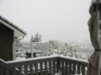
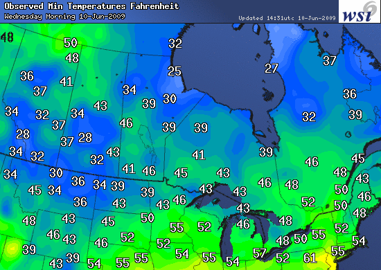
By Matt Vooro
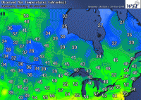
This has been a very chilly spring in Canada. This marks a continued trend of cooling in the last few years likely related to the PDO. Snow even fell this June in the south central (photos from Calgary courtesy Madhav Khandekar).
Lows this morning (courtesy of WSI) show the continued chill.
See larger image here.
The trends since 2006, shows most of Canada has participated. The following shows Canada Spring Temperature Trend Comparison 2006-2009 Departures from 1948-2009 Trend.
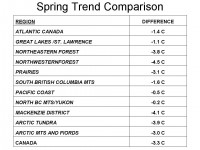
See larger table here.
The difference is calculated using this Environment Canada Data Set as of June 10, 2009.
See pdf here. See Matt’s recap of the incredible Canadian winter here.
By Steve Goddard on Watts Up With That
For the third straight summer, the UK Met Office has forecast hot weather using their state of the art computer models. Summer 2007 and 2008 were complete washouts, ranking as two of the most miserable, rainy summers on record.

31 August 2007
Summer 2007 - a wet season
This summer looks set to have been the wettest since UK rainfall records began in 1914, Met Office figures revealed today
29 August 2008
Wet summer could end with a bang
Forecasters at the Met Office are predicting that that final day of the summer could end with heavy rain and thunderstorms affecting some parts of the country this weekend. Within the UK some local rainfall records have been broken, especially across parts of Northern Ireland and Scotland where flooding severely affected road and rail transport. Provisional rainfall figures show that Northern Ireland had its wettest August since 1914 .
The current summer isn’t looking much better. Here is the forecast from UK Weather Online.
Issued: 0900hrs Friday 5th June 2009
Do you want summer?
Duty forecaster: Simon Keeling & Captain Bob
If you’re requiring rain you’ll be in luck, if you’re wishing for summer, then perhaps don’t hold your breath!
It has now been 1,047 days since London made it to 30C. I admire the persistence of The Met Office in getting their global warming message across to the public. Perhaps their new 30 million UK pound computers will do better with their actual predictions?
Read more here.
By Joseph D’Aleo, CCM, AMS Fellow
Joseph Romm, George Soros’s bulldog at the alarmist climate fantasyland web blog called Climate Progress has a post (h/t Climate Depot) ”NOAA puts out “El Nino Watch, so record temperatures are coming and this will be the hottest decade on record”.
Based on the coming El Nino he hints at upcoming disappointment for climate realists with respect to arctic ice and warmer global temperatures for 2009 and for the decade. Of course he used the bogus NOAA temperatures which have taken the lead in being the most contaminated and exaggerated through station dropout globally, no adjustment for urbanization, a purposeful adjustment up of sea surface temperature warming (compare UNISYS with NOAA satellite), and bad siting (Anthony Watts has identified only 10% of the 948 United States stations meet government’s own standards for siting).
The result is nonsense press releases every month like a year ago in June when NOAA proclaimed it to be the 8th warmest June in 129 years with an anomaly of +0.5C, while the satellites that don’t have these surface errors found it to be the 9th coldest in its 30 years of record keeping with an anomaly of -0.11C. This last month University of Alabama MSU global satellite data had an anomaly of just 0.043C. You can count on NOAA, which has become another Mother Goose to tell a different story when they announce the May global numbers with their bogus assessment. Romm who revels in fairy tales, will surely announce the NOAA results.

See larger image here.
THE REAL STORY
El Nino is coming on very much as it did last year at this time.
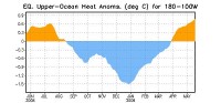
See larger image here.
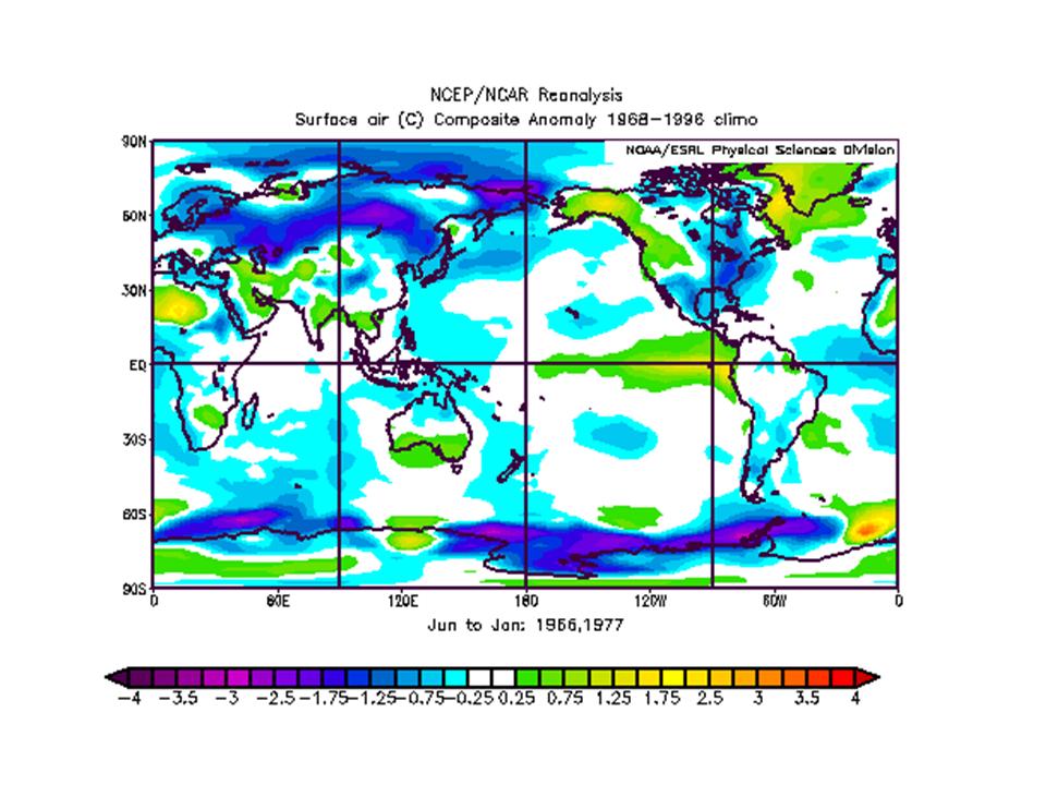
But Romm is ignoring it is doing so in a low solar and cool PDO era, with a cooling Atlantic and after a high latitude volcano, all of which project to a cool summer and a cold winter. The cold PDO usually also means a quick and brief El Nino. Years like 1965/66 and 1976/77 had similar conditions. The summer, fall and following winter composite average shown below. BTW, you won’t here mention of the PDO, ENSO is used only because they need it to explain year to year variability, admitting to the PDO would be game set and match for the alarmists as it would me admitting to a factor that explains the two decades of warming from 1979 to 1998, that was used to make CO2 the culprit.

See larger image here.
He is making the same mistake James Hansen and the UK met office made in early 2007 during a brief El Nino spike, predicted 2007 would be the warmest on record eclipsing 1998. It instead as El Nino gave way to La Nina had the most rapid cooling of the entire satellite record.
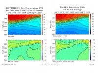
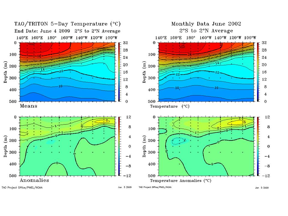
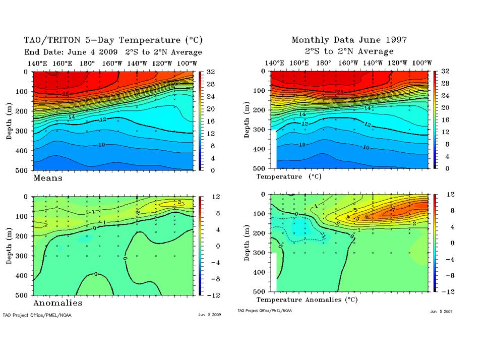
IRI has compiled the El Nino model forecasts and most forecast a transition through neutral (La Nada) and many to El Nino. Hansen’s NASA climate model is the warmest (must use the Hansen adjustment techniques). Lets look at some El Ninos using the TAO Triton cross-sections and see how they compare to this latest ocean water temperature pattern.
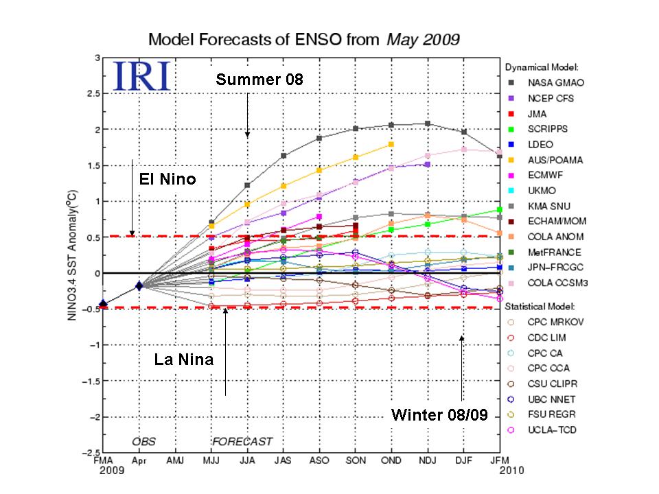
Last year showed a similar summer warming of the tropical Pacific that faded in the fall back to La Nina. Note the similarity in the ocean heat content to June of last year
See larger image here.
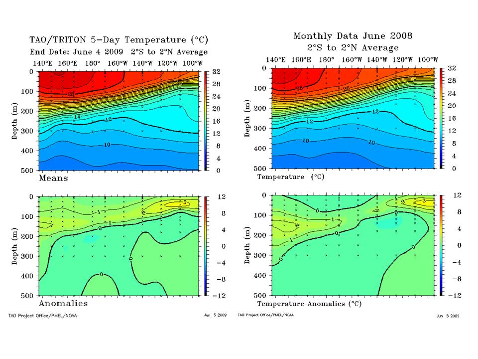
The last moderate El Nino in 2002 led to a very cold winter in the eastern United States with 6 months of below normal temperatures. It was very similar to this year in June.
See larger image here.
The ‘big-daddy’ El Nino of 1997 was much warmer underneath with a strong suppression of the thermocline. Anomalies of greater than +7C compare to the 1-2C anomalies this year. The PDO was in its warm mode in 1997 and the sun was coming back to life strongly both giving the ENSO a boost.
The CPC’s prize CFS climate model (Link here CFS.JPG) shows a cool summer, fall and eastern US winter not (winter not unlike 2002/03).
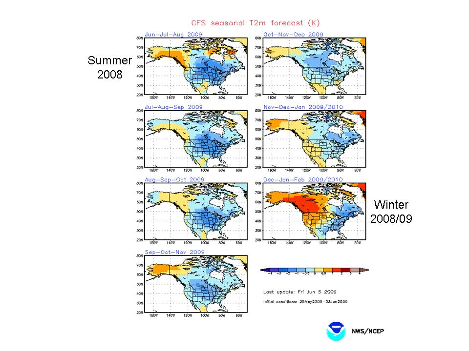
Time will tell (and maybe how much recovery in solar activity) whether we go back to normal or continue El Nino through the winter like 2002/03. La Ninas tend to dominate in low solar winters but El Ninos often pop when the solar activity bounces back.
In any event, it will be Romm who will be talking to himself when the year is over not the climate realists. Adventures in fantasyland can be so entertaining. Recall early this year when Romm lost a debate to Marc Morano who came to argue the science and Romm like most of his ilk simply deferred to authority (railroad engineer Pachauri’s own work of fiction and NOAA’s silly press releases) and went ad hominem, another favorite tactic of those whose science is bankrupt. See pdf with all images here.
By Joseph D’Aleo
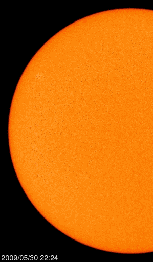
The sun has become more active in recent days with cycles 24 spots in middle latitudes. See sunspot group number 11019 for group of red spots. This is slightly diminished since yesterday. The dark green areas are coronal holes out of which the solar wind escapes at higher velocity.
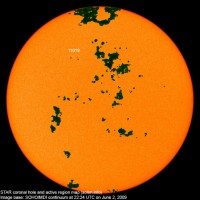
See larger image here.
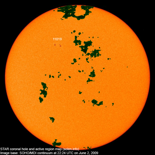
Peter Lawrence has a close up view of that sunspot posted on spaceweather.com.

See larger image here.
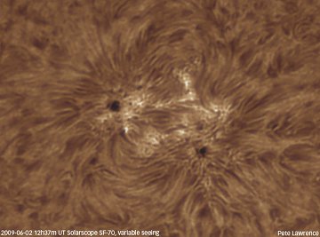
There is a loop of the sunspots develop and rotate around the solar disk the last few days here.
This activity came late enough in the month of May, to keep the monthly number for May below the value of 14 months ago of 3.2 which it is replacing in the 13 month running mean. That means the solar cycle minimum can’t be earlier than November 2008, making it at least a 12.5 year long cycle 23.
The value needs to fall below 3.4 in June to move the minimum to December. That is still possible if the sunspot group continues to decay as most have done as they crossed the disk in recent months. If it stays below that value, we will likely see the solar minimum in December, 2008 as 14 months before that the sun was very quiet with just a sunspot number of 0.5. If not, the minimum will be November. It is my guess that November will win the prize.
We added 22 more sunspotless days to the total for this cycle transition which as of June 1 had now reached an amazing 614 days. We are likely to add additional days and add 2009 to 2007 and 2008 as recent years in the top ten since 1900. Only the early 1900s had a similar 3 year stretch of high sunspot days (1911, 1912, and 1913).
See larger image here.
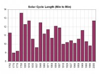
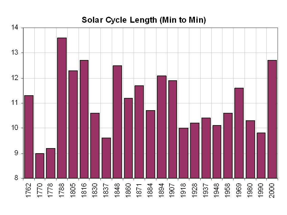
It also marks the longest cycle in 150 years, tying the one that peaked in 1848. You have to go back to the Dalton minimum in 1816 to find a longer cycle 12.7 years.

See larger image here.
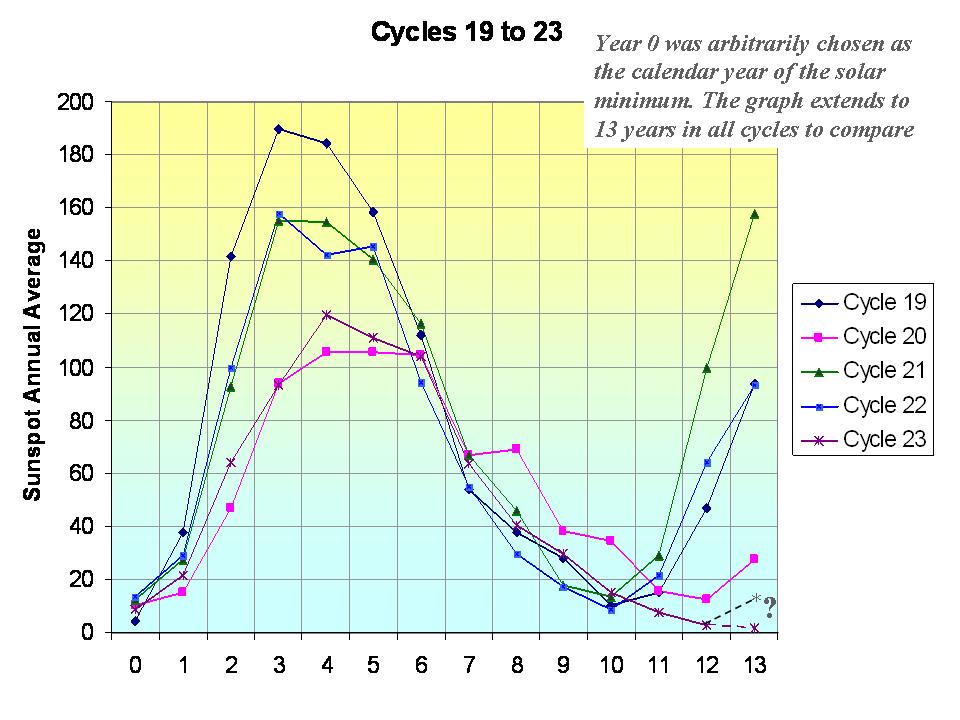
You can see in 3 of the 5 most recent cycles, the sun had rebounded significantly by years 12 and 13 into the next cycle.
See what some scientists believe this means about the decades ahead here.
See also this story in DailyTech from NASA and this Icecap Library post on solar.