By Dr. Roy Spencer, University of Alabama National Space Science and Technology Center, Huntsville in Watts Up with That
In my previous post, I showed evidence for the possibility that there is a natural component to the rise in concentration of CO2 in the atmosphere. Briefly, the inter-annual co-variability in Southern Hemisphere SST and Mauna Loa CO2 was more than large enough to explain the long-term trend in CO2. Of course, some portion of the Mauna Loa increase must be anthropogenic, but it is not clear that it is entirely so. Well, now I’m going to provide what appears to be further evidence that there could be a substantial natural source of the long-term increase in CO2.
One of the purported signatures of anthropogenic CO2 is the carbon isotope ratio, C13/C12. The “natural” C13 content of CO2 is just over 1.1%. In contrast, the C13 content of the CO2 produced by burning of fossil fuels is claimed to be slightly smaller - just under 1.1%.
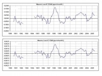
See full size image here
Note the strong similarity - the C13 variations very closely follow the C12 variations, which again (as in my previous post) are related to SST variations (e.g. the strong signal during the 1997-98 El Nino event).

See full size image here.
Significantly, note that the ratio of C13 variability to CO2 variability is EXACTLY THE SAME as that seen in the trends! BOTTOM LINE: If the C13/C12 relationship during NATURAL interannual variability is the same as that found for the trends, how can people claim that the trend signal is MANMADE?? See full report with more graphical support here.
By Steve McIntyre, Climate Audit
Hansen et al 1988 reported that they expected extra warming in the SE United States, a theme that was mentioned in his testimony in Washington in summer 1987. “There is a tendency in the model for greater than average warming in the southeastern and central U.S. and relatively cooler or less than average warming in the western U.S. and much of Europe in the late 1980s and in the 1990s.”
In examining USHCN TOBS data, one sees sort of a “dipole” structure between the eastern and western US that resembles the dipole structure in the Hansen et al 1988 model with one small problem - the sign of the change is reversed. For someone that’s worried about whether my calculations of 20th century trends are accurate, here is a figure from AR4 also showing a cooling trend in the southeast and a warming trend in the west.
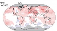
See full size here.
Again I’m not saying that any of these details disprove GHG forcing. However Hansen specifically discussed the southeast US both in his article and emphasized it in his testimony and the actual results should be at least canvassed briefly before saying that Hansen is the new Nostradamus. Read full blog and see more plots here.
By Anthony Watts, Watts Up with That
I’ve found an internal training manual where they show clear evidence of problems with the station record, and even use it as a training example, yet the station record remains part of the data set used for climatological study via the USHCN data set. See it here.
There is a link to the NOAA Profesional Competancy Unit manual at the end of the post.It’s almost comical to look at the station in Baltimore. They even provided a table proving why the station is biased, which is probably why it was closed in May 1999.

This one passage from the manual (pg 39) says it all, plus lends some endorsement to my own work: “When non-compliant situations are extreme, either correct the situation or consider closing the station down. Take digital photographs with each scheduled preventative maintenance visit per guidelines or as needed when change is apparent. And of course, don’t forget to coordinate issues with our climate community partners. They are ready and willing to assist with their climate expertise.”
The section on Reno’s USHCN station is one I previously covered here. So much for Parker 2003 and 2006. Hard to argue “UHI doesn’t exist” when NOAA trains their staff on it. See Anthony’s blog here.
CO2 Science Review of Kolker and Hameed, GRL 2007
The authors note that determining the rate of global sea level rise (GSLR) is complicated by non-tidal, short-term and local variability that is “orders of magnitude greater than the trend.” So complex is the issue, in fact, that the recent rate of GSLR has been estimated to be about 1.1 mm/year by Wadhams and Munk (2004), 1.5-2.0 mm/year by Miller and Douglas (2004), and 2.4-3.8 mm/year by the IPCC (2007), a spread that is much larger than what everyone would like to see.
They show “a major fraction of the variability and the trend in mean sea level at key sites along the Atlantic Ocean are driven by shifts in the position and intensity of the major atmospheric pressure centers that reside over the Atlantic Ocean, the Azores High and the Icelandic Low,” which they refer to as atmospheric centers of action (COAs).
Noting that their results “yield rates of recent sea level rise that are closer to Wadhams and Munk’s 1.1 mm/year than Miller and Douglas’s 1.5-2.0 mm/year,” Kolker and Hameed suggest that their findings could close what they call “the enigmatic gap in GSLR rates” if their results are characteristic of other major ocean basins, which they probably are, as they note that “atmospheric centers of action exist in all ocean basins.” If such eventually proves to be the case, the lower GSLR rates derived by them and Wadhams and Munk would be much less than the 2.4-3.8 mm/year GSLR rate of the IPCC (2007), which would in turn cast great doubt upon the huge magnitude of CO2-induced global sea level rise that is typically predicted by the world’s climate alarmists. Read full review here.
By Roger Pielke, Prometheus
The figure below shows linear trends in temperature for Jim Hansen’s three 1988 scenarios (in shades of blue), for the IPCC predictions issued in 1990, 1995, 2001, 2007 (in shades of green), and for four sets of observations (in shades of brown). I choose the period 1990-2007 because this is the period of overlap for all of the predictions (except IPCC 2007, which starts in 2000).
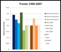
See full size image here
Looking just at these measures of central tendency (i.e., no formal consideration of uncertainties) it seems clear that:
1. Trends in all of Hansen’s scenarios are above IPCC 1995, 2001, and 2007, as well as three of the four surface observations.
2. The outlier on surface observations, and the one consistent with Hansen’s Scenarios A and B is the NASA dataset overseen by Jim Hansen. Whatever the explanation for this, good scientific practice would have forecasting and data collection used to verify those forecasts conducted by completely separate groups.
The data for the Hansen scenarios was obtained at Climate Audit from the ongoing discussion there, and the IPCC and observational data is as described on this site over the past week or so in the forecast verification exercise that I have conducted. This is an ongoing exercise, as part of a conversation across the web, so if you have questions or comments, please share them, either here, or at Climate Audit where I’ll participate in the discussions.
By Anthony Watts, Watts Up with That
There’s an article in the New York Times pushing a something called “the five stages of climate grief” done by a professor at the University of Montana. This got me to thinking about the regular disaster forecasting that we see published in the media about what will happen due to climate change. We’ve seen this sort of angst broadcast before, and it occurred to me that through history, a lot of disasters and “predictions of certainty” with roots in scientifically based forecasts have not come true. That being the case, here is the list I’ve compiled of famous quotes and consensus from “experts”.
See Anthony’s TOP TEN here and think about these the next time you hear about worldwide crop failure, rising sea levels, species extinction, or “climate grief” you might want to remember that just being an expert, or even having a consensus of experts, doesn’t necessarily mean that a claim is true.
Anthony Watts is a former television meteorologist who operates a weather technology and content business, as well as continues daily forecasting on radio, just for fun. He manages two web sites (here and here) where he is coordinating volunteer efforts to document station siting issues for the USHCN climate stations
By Dr. Madhav Khandekar, Rogers Institute in Physics Today
The present global warming debate pays excessive attention to designating a particular year as the warmest ever (PHYSICS TODAY, December 2006, page 30) or the warmest in the past 100 years. Such declarations, begun by the Intergovernmental Panel on Climate Change (IPCC), risk missing the point that the trends are what matter most. The basis for making a claim of the “warmest year” is nothing more than calculating a mean value of temperatures recorded at several land-based stations and combining it with a similar mean over world oceans. Such a “mean” calculation can be misleading since the distribution of observing locations over land and ocean is uneven. Large areas that were only sparsely observed decades ago remain so today.
In a July 2006 report to the House Committee on Energy and Commerce, Edward Wegman of the Center for Computational Statistics at George Mason University stated that the IPCC’s assessment of the 1990s as the “hottest decade in a millennium” and of 1998 as the hottest year “cannot be supported. . . . The paucity of data in the more remote past makes the hottest-in-a-millennium claims essentially unverifiable.” In a 2002 report on extreme weather trends, prepared for the government of Alberta, Canada, I documented that the 1930s had the hottest summers in Canada and possibly in the conterminous US. In a recent reanalysis prompted by Steve McIntyre, weblogger at Climate Audit , NASA has now designated 1934 as the hottest year in the US and not 1998 as previously claimed. As someone who has spent more than 50 years in the science of weather and climate, I find this designation of “warmest year” misleading and almost meaningless. Read more here.
By Craig James, WOOD-TV Blog
NBC did a story the other day on a new study that shows the Antarctic Ice Sheet appears to be melting at a dramatically increased rate over the past 10 years. You can find an article about the study here. The abstract is here. There seems to be some confusion over how this could be since we’ve all heard that the ice in the Southern Hemisphere was at a record high in 2007. I think the confusion is because the ice anomaly shown in the chart below from The University of Illinois Cryosphere site is for sea ice COVERAGE and not the MASS of the Antarctic Ice Sheet, which, of course, is over land. The sea ice coverage is indeed at a record high since satellite observations were taken in 1979, but I don’t believe this takes into consideration the mass of ice over land. Also, the study’s data only goes to 2006 and does not include 2007. To add to the confusion, the NBC reporter apparently didn’t understand the difference between coverage and mass, and even worse, showed video of polar bears.
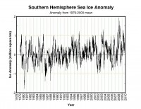
There have been other studies that refute the idea of a reduced mass of the Antarctic Ice Sheet. See here and here. Even the IPCC says the trend in the Antarctic is inconclusive and it is a shame, but not unexpected, that NBC would not mention this. I should also note that it would not be correct to say that the Southern Hemisphere Sea Ice coverage being at a record maximum in 2007 refutes the study about a shrinking of the Antarctic Ice Sheet mass up to 2006, since that would be comparing apples to oranges. Read more here.

Antarctica Orthographic satellite image


