In this important paper, involving 17 co-authors from 13 European countries, we looked at the various “temperature homogenization adjustments” that have been applied to the European temperature records in the widely used “Global Historical Climatology Network” (GHCN) dataset over the last 10 years.
The GHCN dataset is the main data source for thermometer records used by several of the groups calculating “global warming” - including NOAA, NASA Goddard Institute and the Japan Meteorological Agency.
Because these thermometer records typically are several decades to centuries long, they often are contaminated by “non-climatic biases” whenever the weather station undergoes a major change, such as being moved to a new location or a change in the type of instruments used.
In an attempt to try to correct for these non-climatic biases, NOAA, the group in charge of the GHCN dataset had been running a computer program to try and statistically identify “non-climatic jumps” in the records by comparing each station record to 40 of its nearest neighbors. This process is called “temperature homogenization”, and until now, most groups had been assuming the process was working correctly.
However, for this study, we analyzed 10 years of different “homogenization adjustments” applied by NOAA to more than 800 European temperature records. We found that the adjustments NOAA was applying to each station record changed dramatically every time they re-ran their homogenization computer program! And they have been re-running this program almost every day since 2011.
We found that only 16% of the adjustments NOAA had been applying to the thermometer records were consistent from run to run.
Moreover, by compiling the “station history metadata” associated with each of the stations we analyzed from the various national meteorological services and other scientific studies, we were able to compare the adjustments applied by NOAA to the documented station changes that were known to have occurred. We found that less than 20% of the adjustments NOAA had been applying corresponded to any event noted by the station observers - such as a change in instrumentation, station move, etc.
The findings of our study suggest that many of the “homogenization adjustments” that have been applied to the main thermometer records used for studying climate change over the last 10 years may have been spurious.
We conclude our study by making various recommendations for how these problems might be resolved with more careful scrutiny of the data.
See Tony Heller’s killer video here on how the US state data is corrupted with these ‘adjustments’.
See this paper I authored “A Critical Look at Surface Temperature Records” for Evidence Based Climate Science in 2011 here. See a major compilation of earlier studies SURFACE TEMPERATURE RECORDS: POLICY-DRIVEN DECEPTION? here
The New York Times “Climate Fwd.” runs a touching feature on West Windsor, VT, rocked by the closure of the local ski resort “because of erratic snowfall and mismanagement”, whose plucky inhabitants responded by creating “a model for how a small ski area and its community can thrive in the era of climate change” that replaced bad private enterprise with good government and downhill skiing with mountain biking, endurance running and… um...downhill skiing. Actually there’s no less snow there than there ever was. Still, beware, because “A 2019 study showed that in northeastern states besides Vermont, at least half of ski areas will close by the mid 2050s if high greenhouse gas emissions continue.” Yeah, we heard that one before. So a modern news story doesn’t describe something that happened, or even check if it did. Instead it describes something that the writer thinks should have happened and some scientists say eventually will except it’s a scientifically impossible scenario. And they wonder why their circulation is falling faster than snow in a Vermont winter.
In case anyone at the paper still remembers when fact-checking meant checking facts not censoring opinions, the study in question wasn’t even published in 2019. It was published in 2017. And it’s remarkably coy about details like whether RCP 8.5 is lurking amid the moguls. Instead it basically looked at a bunch of papers saying climate change would wipe out skiing and found a strong tendency for them to say skiing would be wiped out by climate change. And also that papers saying climate change will wipe out skiing are a growth industry, in case you’re on the scrounge for a grant in order to study vital questions like whether skiers are unhappy if there’s not enough snow.
Incredibly, they are. The researchers “found that in general demand related to ski lifts (e.g. revenues, skier days, number of transported people) is more sensitive to a lack of snow than overnight stays.” And no sum is too high for that kind of insight.
Speaking of insights, an accompanying Times piece describes one enthusiastic skier at the tiptop of Mt. Ascutney pointing to other snow-covered peaks with ski resorts and lamenting that more than a decade ago they would get lots of snow and it would “just bypass Ascutney”. We couldn’t win”. Put that together with the fact that bad management closed the resort and you get...nothing. Not a decrease in snow. Not a hit of climate change. Not even an estimate of when it hit. Was it already causing less snow on this one mountain though not others nearby in 2010? In 2005? Never? (Mind you a new paper says fisheries will be rocked as “On average, the ToE of the deoxygenation signal in the mesopelagic zone is projected to emerge in 2021” if… we use RCP 8.5. So it’s here now, unless it’s not. But far too late to finish off that resort which, in any case, is open under new management.)
Still, let’s not nitpick. How bad is the snowfall crisis in the area now? Well, it turns out the actual town of West Windsor now gets a mere 76 inches of snow a year, doubtless baffling local children whenever it does fall in a thick white blanket every year. And a resort inexplicably located on nearby bare-dirty-rock Mt. Ascutney, home of the failed resort, boasts that “Alpine skiers have been thrilled about Ascutney’s varied terrain and friendly appeal for over 60 years” before inviting you to experience “8 trails/ 26 acres of skiable terrain for all ability levels/ a 450-foot vertical drop/ the longest run of 3100 feet.” Who are these fools to think you can ski there?
By the way, for non-skiers, “alpine” isn’t a creative climate-era alternative to “downhill” skiing. It is downhill skiing. And Wikipedia reports that one of Ascutney’s hated rivals, the cleverly named “Killington Mountain Resort & Ski Area” (see, it’s a mountain resort and ski area on Mt. Killington), “is the largest ski area in the eastern U.S., and has the largest vertical drop in New England at 3,050 feet (930 meters). Since 2013-14 ski season, it has been called the ‘Beast of the East.’” Not, be it noted, “the place there used to be snow”.
To be fair, in what the Times calls “the era of climate change”, Killington has a mere 155 runs, of which just 39% are black diamond, as part of a complex with only 21 lifts barely capable of taking 37,000 people up the mountain per hour to enjoy its feeble 10 feet of natural snow per year plus the artificial stuff. And if it sounds bleak, nearly Okerno Mountain Resort, rated “the Top US Family Snow Resort” by Parents Magazine back in 2010, is even smaller than Killington despite getting 16.6 feet of snow a year.
If you’re now thinking whoa, that’s too much snow, it’s also close to Mount Sunapee with just eight feet of the stuff. But it somehow maintains 66 runs, while a fourth local competitor, Stratton Mountain, has 99 runs and 15 feet of snow. As for poor doomed barren Ascutney it gets… what’s this? Over sixteen feet of snow a year? (And if you care about the global ski industry crisis, with CO2 skyrocketing, January temperatures in Germany have been falling since 1988, presumably melting the nearby Alps and ruining Austria’s ski industry too.)
If you’re not a skier you might be wondering what all the fuss is about. So are we, but for a different reason. We’re worried about the incredible failure of media outlets to check basic facts when peddling climate change. There isn’t the slightest indication that skiing in Vermont is in any kind of danger, nor that Mount Ascutney is not getting snow. Ottawa gets under six feet a year and it sometimes feels like a lot. They get nearly three times that.
The Times hallucinated the whole thing. Typically. This sort of story gets published nowadays without any sort of editorial oversight or scruples. The end of winter as we know it, unnoticed. And to think people sometimes doubt the urgency of the climate crisis.
See this fact check on the claims of disappearing snow here.
Given the NYT’s litany of failed claims over the years, you might expect this is more likely the situation in the not to distant future plowing access roads to the slopes.
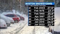
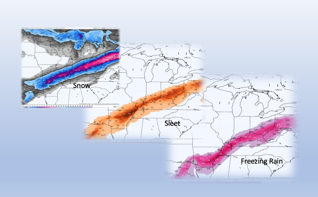
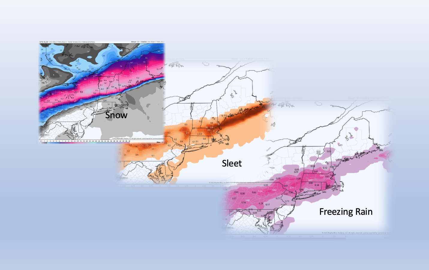
As I predicted, climate change has been blamed for the recent New England blizzard (e.g. from Bloomberg here). During that storm, Boston tied its 24-hr snowfall record at 23.6 inches.
Terry Eliasen at CBS Boston wrote: “While we didn’t break any of the big records in Boston, this storm does have a place in the record books:
Second biggest snowstorm in January history in Boston. It was just shy of the Jan. 27, 2015 storm which dropped 24.6 inches. Seventh biggest all-time snowstorm (of any month) in Boston. It was 4.1 inches shy of the 27.6” that fell in February of 2003, the top dog on the list. With 35.9” this month, January 2022 will go in the books tied with January 1978 for the fourth snowiest January on record
Boston now sits at 36.3” for the season, more than a foot above the average snow to date. This winter has been absolutely crazy - 97% of the total snowfall for the entire season has fallen on two days, January 7th and January 29th.
Breaking it down even further, you could say 97% of our snowfall this season in Boston has fallen in about 15 hours! Incredible!
Yet, as recently as January 6, we were told by USAToday that Boston’s lengthy 316-day streak *without* one inch of snowfall as of January 1st was caused by global warming.
So, which is it? Global warming causes less snow, or more snow?
When science produces contradictory claims, is it really science?
Roy continues: DrRoySpencer.com has been demonetized by Google for “unreliable and harmful claims”. This means I can no longer generate revenue to support the website using the Google Adsense program.
From a monetary standpoint, it’s not a big deal because what I make off of Google ads is in the noise level of my family’s monthly budget. It barely made more than I pay in hosting fees and an (increasingly expensive) comment spam screener.
I’ve been getting Google warnings for a couple months now about “policy violations”, but nowhere was it listed what pages were in violation, and what those violations were. There are Adsense rules about ad placement on the page (e.g. a drop-down menu cannot overlay an ad), so I was assuming it was something like that, but I had no idea where to start looking with hundreds of web pages to sift through. It wasn’t until the ads were demonetized that Google offered links to the pages in question and what the reason was.
Of course, I should have figured out it was related to Google’s new policy about misleading content; a few months ago Google announced they would be demonetizing climate skeptic websites.
....or now I don’t plan on appealing the decision, because it’s not worth the aggravation. If you are considered a “climate skeptic” (whatever that means) Google has already said you are targeted for termination from their Adsense program. I can’t expect their liberal arts-educated “fact checkers” to understand the nuances of the global warming debate.
-------------
ICECAP Update:
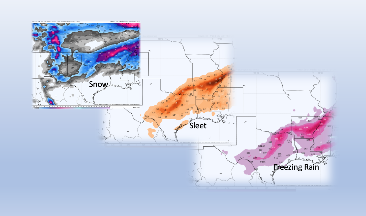
A new storm, this more problem with ice will create havoc in a large area this week.
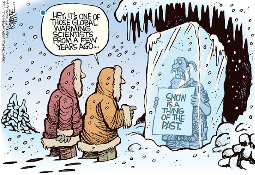
In early December, the Washington Post reported that because of climate change, snow in the Mountain West “may vanish for years at a time.”
The headline did not age well.
Only days later it started to snow in the West.
And snow.
And snow.
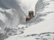
An incredible photo on Twitter showed a towering wall of snow on Donner Summit in California around Christmas.
Lake Tahoe got 18 feet of snow in December, an all-time record.
In Virginia, some motorists were stuck on I-95 for more than 24 hours after snow and ice made the road impassable.
A Long String of Failed Climate Change Predictions
Add the Washington Post headline to a long string of failed climate change predictions. A now-deleted headline from the London Independent in 2000 predicting no more snow is more than 20 years old.
Climate experts now seem to have hedged their bets, saying global warming will both increase and decrease snowfall.
Weatherbell Meteorologist Joe Bastardi, the author of The Weaponization of Weather in the Phony Climate War, says more snow or less snow, it’s called a normal winter.here. It might be more snow in one place and less snow in another place, but then it balances out.”
“The weather is always going back and forth,” Bastardi said. “This is within the realm of what you can expect in the kind of winter we have
New Calls for ‘Climate Lockdowns; (And It’s Not a Conspiracy Theory)
But climate activists continue to insist that we face a worldwide climate emergency, and there has been more talk of the need for “climate lockdowns.”
Over the holidays, environmentalists staged what they called “Occupy Biden” - an 8-day protest outside Joe Biden’s Delaware home, demanding that he take action on the climate.
“Occupy Biden” Spokesman Ted Glick said, “We want Joe Biden to issue an executive order declaring a climate emergency. He’s already said it’s a code red emergency.”
Dozens of nations have declared climate emergencies, including the entire European Union.
And now, after accusing climate skeptics of inventing a conspiracy theory about future climate lockdowns, there has been increasing talk of instituting climate lockdowns, modeled after COVID lockdowns, and under what’s being called environmental authoritarianism, in which your right to drive a car, fly on a plane or own a big house could be suspended by the government in order to fight climate change.
Climate Lockdown: Less Driving, Flying, and Eating Meat
“Americans are going to have to deal with less,” warns Marc Morano, author of Green Fraud: Why the Green New Deal Is Even Worse Than You Think. “We’re gonna drive less, fly less, eat less meat. They’re already talking about sustainable housing and shutting down the suburbs.”
“This is the progressive vision of how you make people do with less in a climate emergency,} Morano says.
A recent article in the influential magazine Foreign Policy suggested Democracy may not be compatible with reaching climate goals.
The Weather Record Shows There is Not a Climate Problem
This climate extremism is all escalating even though the weather record shows there is not a serious problem with the climate. The Environmental Protection Agency’s own website says our air continues to get cleaner year after year. Statistics also show the number of wildfires is much lower than it was decades ago.
Theoretical Physicist Dr. Steven Koonin, former Undersecretary of Energy during the Obama Administration and author of Unsettled: What Climate Science Tells Us, What It Doesn’t, and Why It Matters, says the weather record shows there is no climate emergency.
Heatwaves in the U.S. are now no more common than they were in 1900 and they haven’t gone up in 60 years,” Koonin said, “No global trends in drought or in floods. Greenland’s ice sheet isn’t melting any more rapidly now than it was 80 years ago. There’s no long-term trend in hurricanes over the last hundred years.”
But climate activists are advancing their agenda anyway, and new government regulations continue to punish and de-fund more reliable fossil fuel sources in favor of less reliable renewable energy sources.
Occupy Biden’s Glick said Joe Biden “should issue, have the federal agencies oppose any new fossil fuel infrastructure.”
Environmental expert Dr. Marlo Lewis at the Competitive Enterprise Institute says, “Basically this political movement has declared war on fossil fuels. And a lot of people have concluded in the industry, and also people who are investors, that this sector has no future.”
The Cost to ‘Stop Climate Change’? $1 Quadrillion
Rising energy prices this winter could be only the beginning. A recent study in the journal Nature found that meeting reduced carbon emission targets will cost more than $2 trillion annually - that’s more than $5,000 per American per year - with costs by the end of this century totaling $1 quadrillion dollars.
This piece originally appeared at CBN News and has been republished here with permission.
Lake Tahoe got 18 feet of snow in December, an all-time record.
In Virginia, some motorists were stuck on I-95 for more than 24 hours after snow and ice made the road impassable.
A Long String of Failed Climate Change Predictions
Add the Washington Post headline to a long string of failed climate change predictions. A now-deleted headline from the London Independent in 2000 predicting no more snow is more than 20 years old.
Dozens of nations have declared climate emergencies, including the entire European Union.
And now, after accusing climate skeptics of inventing a conspiracy theory about future climate lockdowns, there has been increasing talk of instituting climate lockdowns, modeled after COVID lockdowns, and under what’s being called environmental authoritarianism, in which your right to drive a car, fly on a plane or own a big house could be suspended by the government in order to fight climate change.
Climate Lockdown: Less Driving, Flying, and Eating Meat
A recent article in the influential magazine Foreign Policy suggested Democracy may not be compatible with reaching climate goals.
But climate activists are advancing their agenda anyway, and new government regulations continue to punish and de-fund more reliable fossil fuel sources in favor of less reliable renewable energy sources.
Occupy Biden’’s Glick said Joe Biden “should issue, have the federal agencies oppose any new fossil fuel infrastructure.”
Environmental expert Dr. Marlo Lewis at the Competitive Enterprise Institute says, “Basically this political movement has declared war on fossil fuels. And a lot of people have concluded in the industry, and also people who are investors, that this sector has no future.”
The Cost to ‘Stop Climate Change’? $1 Quadrillion
Rising energy prices this winter could be only the beginning. A recent study in the journal Nature found that meeting reduced carbon emission targets will cost more than $2 trillion annually - that’s more than $5,000 per American per year - with costs by the end of this century totaling $1 quadrillion dollars.
This piece originally appeared at CBN News and has been republished here with permission.i
The Arctic Ocean is warming up, icebergs are growing scarcer and in some places, the seals are finding the water too hot according to a report to the Commerce Department yesterday from the Consulate at Bergen, Norway.
Reports from fishermen, seal hunters, and explorers all point to a radical change in climate conditions and hitherto unheard of temperatures in the Arctic zone.
Exploration expeditions report that scarcely any ice has been met as far north as 81 degrees 29 minutes.
Soundings to a depth of 3,100 meters showed the gulf stream still very warm. Great masses of ice have been replaced by moraines of earth and stones, the report continued, while at many points well known glaciers have entirely disappeared.
Very few seals and no white fish are found in the eastern Arctic, while vast shoals of herring and smelts, which have never before ventured so far north are being encountered in the old seal fishing grounds. Within a few years, it is predicted that due to the ice melt the sea will rise and make most coast cities uninhabitable.
I must apologize. I neglected to mention that this report was from November 2, 1922, as reported by the AP and published in The Washington Post about 99 years ago.
Thanks to Suzy Houser and Richard McFarland for reminding us.
----------
By Joseph D’Aleo, CCM
I posted recently on my career long adventures in climate (here). Although it covered drivers for extremes and the observed cycles of relative warmth and coldness, my entry into the field and focus after was on winters and snow.
My first memory was being lifted as an infant to the window to see the huge snow piles on the street in Brooklyn, NY. It was the suddenly snowy winters of the late 1950s and early 1960s 1960/61 that grabbed by attention. The winter of 1960/61 with three big storms including the Kennedy Inauguration and the crippling snow of early February that was the clincher. Snow was nearly waist high on the my street in Park Slope.
I attended the University of Wisconsin for Meteorology BS and MS degrees. My Master’s Thesis though was focused on why coastal winter storms can explosively develop (bomb). We showed certainly dynamics were involved but diabatic processes (sensible and latent heat) as cold air over the warm water creates instability that creates strong convection when the lid due to subsidence in high pressure is removed. This process, by the way is similar to what happens in tornado season where storms explode as the cap (lid) is removed as cold fronts displace high pressure as they descend from the western mountains and also the trade wind inversion in the subtropics is removed with a strong easterly wave that allows convection on increase and organize.
I worked on my doctorate at NYU while I was weather producer for WCBS-TV and radio and the CBS network program Energy. I had only 1 memorable storm in my tenure there - the big ice storm of December 17, 1973. I was working a weekend forecasting for the radio and TV. I was one of the first to use the new tools available and saw that the cold air which delivered a some snow on Sunday, would hold at the surface in the city and to the north even as warm air aloft invaded. I predicted an ice storm. The TV producer barged into the weather office and challenged the ice forecast based on the radio NWS and other forecasters. I explained my reasoning but he changed the TV script. The radio stayed with the ice forecast. The producer took a leave of absence.
I stayed another year before moving north to help Merle Woodall build the met program at Lyndon State College. With efforts like the Winter Storm Conference (still going), AFROTC, summer internships, forecasting/radio and cable TV broadcasting programs, the program grew from 37 to 137 in 6 years. I left the program in 1980 though to join John Coleman in Chicago as Weather Producer for Good Morning America and year later as the first Director Meteorology at The Weather Channel. Many of my students joined me to help make that a huge success. I was there in the late 1970s when the worry of Global Cooling and the possibility of a developing Ice Age due to the natural cycles amplified by the ‘human volcano’ - particulate matter blocking. incoming solar radiation was at its peak and getting media coverage.
I left TWC to join WSI as Product Marketing Manager in 1989 where we built weather workstations, value-added products and an early internet service Intellicast. As Dr. Dewpoint, my focuses was in climate and weather attribution studies and statistical approaches for predicting winter weather and even a SNOW INDEX for seasonal snow forecasts for major northeast cities. When the dot com bubble burst, management panicked and shut down Intellicast operations.
I left WSI to be a partner in a hedge fund where we hit home runs for 3 years including the frigid northeast northeast January 2004, the hurricanes of 2005. In year 3, we were ranked 2nd of 167 plus hedge funds with less than 50 million under management. But again a hedge fund panic had us not reach contracted amount of $100 million in 4 years and disbanded. I returned to WSI as Dr. Dewpoint and ag forecaster and then joined Joe Bastardi at Weatherbell Analytics, who like me had spent much of his career trying to understand what was behind weather events and seasonal weather.
Since 2007, I started and built Icecap. We have had 10000 posts and 164 million page views.
With Intellicast and Icecap local visibility as Dr. Dewpoint, I became a fixture at the NWS Eastern Region and BHO Annual Winter weather Workshops where I presented my winter outlook and reasoning and even debated a Gore disciple - turned the audience around from 75% believers to 75% skeptical.
I did many interviews and was asked to challenge special reports about the disappearance of snow the media was quick to pounce on in every less snowy winter. I posted responses on
Icecap. Like this one.
Big winters usually had someone say that greenhouse warming was responsible for that too (all extremes become a non-falsifiable hypothesis).
The Union of Concerned Scientists (UCS) that is involved heavily in college programs, did a report on Mt Washington in the summer of 2007, saying global warming marked the end of the ski industry and would lead to the demise of the Maple Sugar Industry as Maple trees would pack their bags and headed to Canada. That winter set all-time records for snow in northern New England. Ouch. But that doesn’t stop them as they come back as they did in 2015 as a warm El Nino approached. I assembled a team of a dozen real scientists and we responded here point by point.
I did many shows on cable here in NH and had a weekly newspaper column. I was asked finally to debate the UNH professor at the Science Technology and Energy Committee - an hour for each of us. The professor started by saying he was not a modeler but a data guy and spent his hour presenting DATA FROM THE CLIMATE MODELS. I responded by showing the real data that each claim was wrong. One of the members of the committee asking how I could explain snow disappearing from the Himalayas. My answer was that the claim was false. The Himalayas cover approximately 1,500 mi (2,400 km) and pass through the nations of India, Pakistan, Afghanistan, China, Bhutan and Nepal. 100 peaks are over 7,200m - 23,622 feet. I told her outside a few intense hurricane eyes, temperatures at 18,000 never rise over 32F. The snows are not at risk of melting there, here in NH and in the hemisphere.
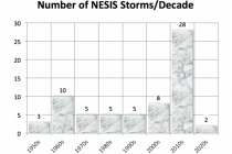
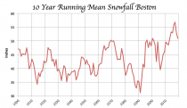
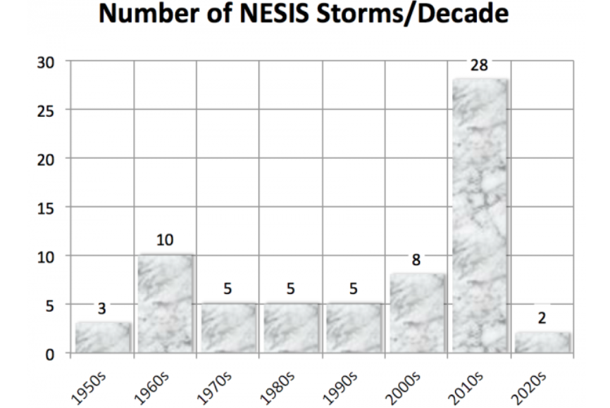
BTW, the last decade was the snowiest for the hemisphere (fall and winter) and for the major cities of the east.


_thumb.png)


_thumb.png)
.png)
.png)