


By Henk Tennekes on Climate Science
Roger Pielke Sr. has graciously invited me to add my perspective to his discussion with Gavin Schmidt at RealClimate. If this were not such a serious matter, I would have been amused by Gavin’s lack of knowledge of the differences between weather models and climate models. As it stands, I am appalled. Back to graduate school, Gavin!
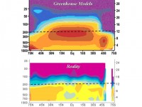
A weather model deals with the atmosphere. Slow processes in the oceans, the biosphere, and human activities can be ignored or crudely parameterized. This strategy has been very successful. The dominant fraternity in the meteorological modeling community has appropriated this advantage, and made itself the lead community for climate modeling. Backed by an observational system much more advanced than those in oceanography or other parts of the climate system, they have exploited their lead position for all they can. For them, it is a fortunate coincidence that the dominant synoptic systems in the atmosphere have scales on the order of many hundreds of kilometers, so that the shortcomings of the parameterizations and the observation network, including weather satellite coverage, do not prevent skillful predictions several days ahead.
A climate model, however, has to deal with the entire climate system, which does include the world’s oceans. The oceans constitute a crucial slow component of the climate system. Crucial, because this is where most of the accessible heat in the system is stored. Meteorologists tend to forget that just a few meters of water contain as much heat as the entire atmosphere. Also, the oceans are the main source of the water vapor that makes atmospheric dynamics on our planet both interesting and exceedingly complicated. For these and other reasons, an explicit representation of the oceans should be the core of any self-respecting climate model.
However, the observational systems for the oceans are primitive in comparison with their atmospheric counterparts. Satellites that can keep track of what happens below the surface of the ocean have limited spatial and temporalresolution. Also, the scale of synoptic motions in the ocean is much smaller than that of cyclones in the atmosphere, requiring a spatial resolution in numerical models and in the observation network beyond the capabilities of present observational systems and supercomputers. We cannot observe, for example, the vertical and horizontal structure of temperature, salinity and motion of eddies in the Gulf Stream in real time with sufficient detail, and cannot model them at the detail that is needed because of computer limitations. How, for goodness’ sake, can we then reliably compute their contribution to multi-decadal changes in the meridional transport of heat? Are the crude parameterizations used in practice up to the task of skillfully predicting the physical processes in the ocean several tens of years ahead? I submit they are not.
Since heat storage and heat transport in the oceans are crucial to the dynamics of the climate system, yet cannot be properly observed or modeled, one has to admit that claims about the predictive performance of climate models are built on quicksand. Climate modelers claiming predictive skill decades into the future operate in a fantasy world, where they have to fiddle with the numerous knobs of the parameterizations to produce results that have some semblance of veracity. Firm footing? Forget it!
Gavin Schmidt is not the only meteorologist with an inadequate grasp of the role of the oceans in the climate system. In my weblog of June 24, 2008, I addressed the limited perception that at least one other climate modeler appears to have. A few lines from that essay deserve repeating here. In response to a paper by Tim Palmer of ECMWF, I wrote: “Palmer et al. seem to forget that, though weather forecasting is focused on the rapid succession of atmospheric events, climate forecasting has to focus on the slow evolution of the circulation in the world ocean and slow changes in land use and natural vegetation. In the evolution of the Slow Manifold (to borrow a term coined by Ed Lorenz) the atmosphere acts primarily as stochastic high-frequency noise. If I were still young, I would attempt to build a conceptual climate model based on a deterministic representation of the world ocean and a stochastic representation of synoptic activity in the atmosphere.”
From my perspective it is not a little bit alarming that the current generation of climate models cannot simulate such fundamental phenomena as the Pacific Decadal Oscillation. I will not trust any climate model until and unless it can accurately represent the PDO and other slow features of the world ocean circulation. Even then, I would remain skeptical about the potential predictive skill of such a model many tens of years into the future. See post here.
Read three essays by Tennekes here.
By Steve McIntyre in Climate Audit on January 27th, 2009
Yesterday Ross and I submitted an article to the International Journal of Climatology with the following abstract:
A debate exists over whether tropical troposphere temperature trends in climate models are inconsistent with observations (Karl et al. 2006, IPCC (2007), Douglass et al 2007, Santer et al 2008). Most recently, Santer et al (2008, herein S08) asserted that the Douglass et al statistical methodology was flawed and that a correct methodology showed there is no statistically significant difference between the model ensemble mean trend and either RSS or UAH satellite observations. However this result was based on data ending in 1999. Using data up to the end of 2007 (as available to S08) or to the end of 2008 and applying exactly the same methodology as S08 results in a statistically significant difference between the ensemble mean trend and UAH observations and approaching statistical significance for the RSS T2 data. The claim by S08 to have achieved a “partial resolution” of the discrepancy between observations and the model ensemble mean trend is unwarranted.
Attached to the article as Supplementary Information was code (of a style familiar to CA readers) which, when pasted into R, will go and collect all the relevant data online and produce all the statistics and figures in the article. In the event that Santer et al wish to dispute or reconcile any of our findings, we have tried to make it easy for them to show how and where we are wrong, rather than to set up pointless roadblocks to such diagnoses. (Icecap note: as Santer did)
We only consider the comparison between the model ensemble mean trend and observations (the Santer H2 hypothesis). Read Steve’s full post here.
Read the NIPCC report which promoted this missing fingerprint of AGW here. Read a pre-Santer et al reponse to another lame Real Climate attack on the NIPCC findings here.
By Joseph D’Aleo, CCM, AMS Fellow
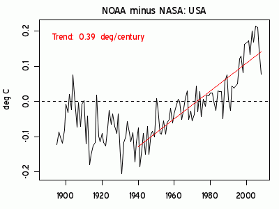
Issues with the United States and especially the global data bases make them inappropriate to use for trend analysis and thus any important policy decisions based on climate change. These issues include inadequate adjustments for urban data, bad instrument siting, use of instruments with proven biases that are not adjusted for, major global station dropout, an increase in missing monthly data and questionable adjustment practices.
NOAA NCDC USHCN - US CLIMATE DATA
When first implemented in 1990 as USHCN version1, it employed 1221 stations across the United States. In 1999, NASA’s James Hansen published this graph of USHCN version 1 annual mean temperatures:
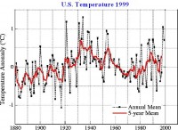
About which Hansen correctly noted: “The U.S. has warmed during the past century, but the warming hardly exceeds year-to-year variability. Indeed, in the U.S. the warmest decade was the 1930s and the warmest year was 1934.”
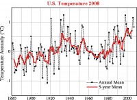
USHCN was generally accepted as the world’s best data base of temperatures with the stations most continuous and stable, and adjustments made for time of observation, urbanization, known land use changes around sites, and instrumentation changes, each of which can produce major contamination issues for temperature data.
NOAA NCDC removed the urbanization adjustment of Karl et al (1988) in version 2 in 2007. GISS continues to adjust US data for urban heat islands using the satellite determined brightness which categorizes stations as rural, small towns and cities. Here is the latest GISS plot of the US temperatures.
See larger image here.
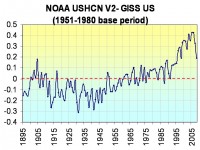
The difference between the NOAA NCDC USHCN version 2 and GISS shows that NOAA’s new algorithm fails to correct for urbanization warming. In fact the NCDC changes have introduced a warming of 0.75F in the 75 years since 1930. Man made warming indeed but the men are in Asheville, NC.
See larger image here.
See in the linked PDF how this and other issues creates serious questions about the NOAA US data. Also see how GISS urban adjustment globally fails the test largely because of the lack of accurate metadata (population, siting particulars etc) with about as many urban areas adjusted up as down and how NOAA GHCN and Hadley CRUT3v perform no UHI adjustment but accounts for urbanization by simply increasing the uncertainty by a mere 0.1C per CENTURY.
See how all the other issues most notably major station dropout and missing data, bad siting equipment issues make all the global data bases completely unreliable for trend assessment or for policy decision making. The only reliable data base is the satellite MSU (RSS and UAH) but unfortunately it goes only back to 1979.
My thanks to Ken Gregory of Friends of Science for providing a synopsis of the many excellent and relevant posts by Steve McIntyre on GISS data and of course to Steve and Anthony Watts for their superb work that benefited this report. Again see pdf here.
Man, 93, Freezes to Death in HomeIcecap normally does not post this kind of story. But because of failing economy, rapidly rising umeployment and no realtistic energy plans by a totally ineffective congress this story will I am afraid be common in the years ahead. People will die from cold in winter, heat in summer because there is no power or they can’t afford to pay their bills due to unemployment, drying up of retirement money, etc. This will disproportionaly hurt the poor and lower class, as this earlier post said so well. This was another story from the UK of a woman who died from stress over large bill to make her home eco-friendly a short while ago. Here is the AP story from Bay City, Michigan.
AP BAY CITY, Mich. (Jan. 26) - A 93-year-old man froze to death inside his home just days after the municipal power company restricted his use of electricity because of unpaid bills, officials said. Marvin E. Schur died “a slow, painful death,” said Kanu Virani, Oakland County’s deputy chief medical examiner, who performed the autopsy.
Neighbors discovered Schur’s body on Jan. 17. They said the indoor temperature was below 32 degrees at the time, The Bay City Times reported Monday.
“Hypothermia shuts the whole system down, slowly,” Virani said. “It’s not easy to die from hypothermia without first realizing your fingers and toes feel like they’re burning.” A city utility worker had installed a “limiter” device to restrict the use of electricity at Schur’s home on Jan. 13, said Bay City Manager Robert Belleman. The device limits power reaching a home and blows out like a fuse if consumption rises past a set level. Power is not restored until the device is reset.
There was no word Monday whether the device had blown out or confirmation of the amount Schur owed to Bay City Electric Light & Power; city officials did not respond to a call seeking comment. Belleman said he didn’t know if anyone made personal contact with Schur to explain how the device works.
The body was discovered by neighbor George Pauwels Jr., who said Schur had almost $1,100 in unpaid electric bills. Pauwels told the newspaper he saw cash clipped to those bills on the kitchen table on the day he found Schur’s body.
“His furnace was not running, the insides of his windows were full of ice the morning we found him,” Pauwels told the Bay City News. Belleman said city workers keep the limiter on houses for 10 days, then shut off power entirely if the homeowner hasn’t paid utility bills or arranged to do so. He said Bay City Electric Light & Power’s policies will be reviewed, but he didn’t believe the city did anything wrong.
By Meteorologist Art Horn
Much has been written of late about a new study out of the University of Washington about how Antarctica is not getting colder but is actually getting warmer. One of the authors is the Michael Mann. Enough has been said about his hockey stick, we all know about its shortcomings.
Recently I had a chance to question Mr. Mann at a talk he was giving in southwestern Connecticut. I asked him if he could explain how global average temperature had only gone up two out of the last seven decades even though eighty percent of all the carbon dioxide humans have put into the atmosphere has been since 1940? His response was that he disagreed with my figure of 80 percent since 1940, he said most of the carbon dioxide had been emitted in the last 15 years. He also was unaware that the global average temperature has only risen two of the last seven decades. He said that statement was simply not true. I can only guess he’s been looking at failed computer model forecasts and a broken hockey stick, not real data. It was quite stunning to hear his ignorance about the trend in temperature for the last seven decades.
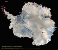
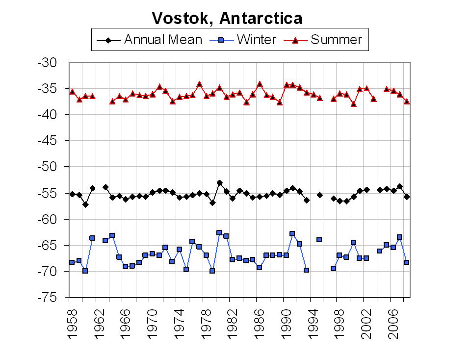
Now as far as Antarctica warming goes I thought it would be instructive to actually look at some temperature data from the interior of the frozen continent. Enter Vostok station. Vostok was opened in the geophysical year in 1957 on December the 16th. Since then there has been an almost unbroken record of surface air temperature record. The station is located at 78 degrees 27 minutes south and 106 degrees 52 minutes east or about 780 miles from the South Pole. The station is number 15 in this image of Antarctica (fig 1).
See larger image here.
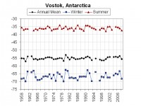
The station was opened by the Russians but now is run by the Russians, French and Americans. The mean temperature for Vostok in 1958 was -55.4 degrees Celsius. Ten years later in 1968 the mean was -55.7 degrees, slightly colder. Another 10 years goes by and in 1978 the mean at the station is -55.2 degrees, a bit warmer. By 1988 the mean temperature had risen a little to -55.1 degrees. During the 10 year period from 1978 to 1988 the world record low temperature of -129 degrees was reached at the station on July 21st 1983. By 1998 a year after the great El Nino of 1997 Vostok had a mean temperature of -56.6, a bit colder than 10 years earlier.
Last year the station had a mean temperature of -55.6 a little warmer or should I say less cold! The -55.6 is slightly colder by 0.2 degrees than the -55.4 recorded 50 years ago, not much warming going on here and in fact none. See the graph in figure 2 for a visual of how little change there has been at Vostok. Granted this is only one station but the fact remains that this is REAL DATA and not statistical game playing. The numbers speak for themselves. By the way on August 8th 2005 Vostok had an unofficial low temperature of -122 degrees, very cool indeed.
See larger image here.
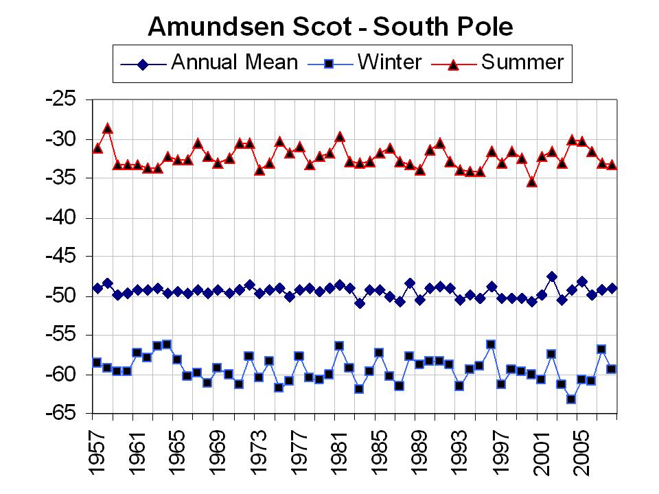
Amundsen Scot AFB (figure 3) at the South Pole (#1 on the map) shows no real annual or summer warming also - with a slight (0.15C) winter cooling. The winter of 2004 was the coldest in the entire record as was the summer of 2000. Read full PDF here.

See larger image here.
By Anthony Watts on Watts Up With That
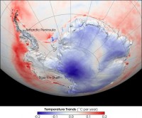
A press release today by the University of Washington makes a claim that Antarctica is warming and has been for the last 50 years: “The study found that warming in West Antarctica exceeded one-tenth of a degree Celsius per decade for the last 50 years and more than offset the cooling in East Antarctica.”
“The researchers devised a statistical technique that uses data from satellites and from Antarctic weather stations to make a new estimate of temperature trends.” “People were calculating with their heads instead of actually doing the math,” Steig said. “What we did is interpolate carefully instead of just using the back of an envelope. While other interpolations had been done previously, no one had really taken advantage of the satellite data, which provide crucial information about spatial patterns of temperature change.”
Satellites calculate the surface temperature by measuring the intensity of infrared light radiated by the snowpack, and they have the advantage of covering the entire continent. However, they have only been in operation for 25 years. On the other hand, a number of Antarctic weather stations have been in place since 1957, the International Geophysical Year, but virtually all of them are within a short distance of the coast and so provide no direct information about conditions in the continent’s interior.
The scientists found temperature measurements from weather stations corresponded closely with satellite data for overlapping time periods. That allowed them to use the satellite data as a guide to deduce temperatures in areas of the continent without weather stations.
Co-authors of the paper are David Schneider of the National Center for Atmospheric Research in Boulder, Colo., a former student of Steig’s; Scott Rutherford of Roger Williams University in Bristol, R.I.; Michael Mann of Pennsylvania State University; Josefino Comiso of NASA’s Goddard Space Flight Center in Greenbelt, Md.; and Drew Shindell of NASA’s Goddard Institute for Space Studies in New York City. The work was supported by grants from the National Science Foundation.
Anytime Michael Mann gets involved in a paper and something is “deduced” it makes me wary of the veracity of the methodology. Why? Mann can’t even correct simple faults like latitude-longitude errors in data used in previous papers he’s written.
But that’s not the focus of the moment. In that press release they cite NASA satellite imagery. Let’s take a look at how the imagery has changed in 5 years.
From the UW paper again: “West Antarctica is a very different place than East Antarctica, and there is a physical barrier, the Transantarctic Mountains, that separates the two,” said Steig, lead author of a paper documenting the warming published in the Jan. 22 edition of Nature. But no, it just couldn’t possibly have anything at all to do with the fact that the entire western side of the Antarctic continent and peninsula is dotted with volcanoes. Recent discovery of new volcanic activity isn’t mentioned in the paper at all. From January 2008, the first evidence of a volcanic eruption from beneath Antarctica’s ice sheet has been discovered by members of the British Antarctic Survey.

See larger here.
The volcano on the West Antarctic Ice Sheet began erupting some 2,000 years ago and remains active to this day. Using airborne ice-sounding radar, scientists discovered a layer of ash produced by a ‘subglacial’ volcano. It extends across an area larger than Wales. The volcano is located beneath the West Antarctic ice sheet in the Hudson Mountains at latitude 74.6South, longitude 97West. Read more and comments here.
Update: In response to questions and challenges in comments, I’ve added imagery above and have a desire to further explain why this paper is problematic in my view. The author of the paper himself (Steig) mentions the subglacial heat source in a response from “tallbloke” in comments. My issue is that they don’t even consider or investigate the possibility. Science is about testing and if possible, excluding all potential candidates that challenge your hypothesis, and given the geographic correlation between their output map and the volcanic map, it seems a reasonable theory to investigate. They didn’t.
But let’s put the volcanoes aside for a moment. Let’s look at the data error band. The UAH trend for Antarctica since 1978 is -0.77 degrees/century. In a 2007 press release on Antarctica, NASA’s describes their measurement error at 2-3 degrees, making Steig’s conclusion of .25 degrees Celsius over 25 years statistically meaningless.
By Steve McIntyre, Climate Audit
In a recent CNN interview discussed at RC here, Joe D’Aleo said: “Those global data sets are contaminated by the fact that two-thirds of the globe’s stations dropped out in 1990. Most of them rural and they performed no urban adjustment. And, Lou, you know, and the people in your studio know that if they live in the suburbs of New York City, it’s a lot colder in rural areas than in the city. Now we have more urban effect in those numbers reflecting - that show up in that enhanced or exaggerated warming in the global data set. “
Gavin Schmidt excoriated this claim as follows: “D’Aleo is mis-directing through his teeth here. He also knows that urban heat island effects are corrected for in the surface records, and he also knows that this doesn’t effect ocean temperatures, and that the station dropping out doesn’t affect the trends at all (you can do the same analysis with only stations that remained and it makes no difference). Pure disinformation.
Later in the comments (#167), an RC reader inquired about UHI adjustments, noting the lack of discusison of this point as follows: #167 In all of the above posts there is no mention of the urban heat island effect, nor of the effect of rural station drop out nor of the effect the GISS data manipulation has on surface temperature. Why is that?
To which Gavin replied: [Response: Because each of these ‘issues’ are non-issues, simply brought up to make people like you think there is something wrong. The UHI effect is real enough, but it is corrected for - and in any case cannot effect ocean temperatures, retreating glaciers or phenological changes (all of which confirm significant warming). The station drop out ‘effect’ is just fake, and if you don’t like GISS, then use another analysis - it doesn’t matter. - Gavin]
Neither CRU nor NOAA have archived any source code for their calculations, so it is impossible to know for sure exactly what they do. However, I am unaware of any published documents by either of these agencies that indicate that they “correct” their temperature index for UHI effect (as Gavin claims here) and so I’m puzzled as to how Gavin expects D’Aleo to be able to “know” that they carry out such corrections.
And as to GISS adjustments, as we’ve discussed here in the past (and I’ll review briefly), outside the US, they have the odd situation where “negative UHI adjustments” are as common as “positive UHI adjustments”, raising serious questions about whether the method accomplishes anything at all, as opposed to simply being a Marvelous Toy. And CRU and NOAA don’t even bother.
CRU Urban Adjustments?
The most recent exposition of CRU methodology is Brohan et al 2006, which stated in respect to UHI that they included an allowance of 0.1 deg C/century in the uncertainty, but does not describe any “correction” to the reported average temperature. To make an urbanisation assessment for all the stations used in the HadCRUT dataset would require suitable meta-data for each station for the whole period since 1850. No such complete meta-data are available, so in this analysis the same value for urbanisation uncertainty is used as in the previous analysis[Folland et al., GRL 2001].
For greater certainty that CRU makes no “correction” for UHI in the actual temperature (only an allowance in the “uncertainty"), Folland et al (GRL 2001) stated: “We add independent uncertainties due to urbanisation, changing land-based observing practices and SST bias corrections. The uncertainties given by RSOA due to data gaps and random errors were augmented using published estimates of global uncertainties associated with urbanization effects (e.g. Jones et al., 1990). We assume that the global average LAT uncertainty increased from zero in 1900 to 0.1C in 1990 (Jones et al, 1990), a value we extrapolate to 0.12C in 2000.”
NOAA UHI Adjustments?
The homepage for the NOAA temperature index is here. It cites Smith and Reynolds (2005) as authority. Smith and Reynolds, in turn, state that they use the identical procedure as CRU, i.e. they make an allowance in uncertainty, but do not correct the temperature index itself.
Contrary to Gavin’s assertion ("Urban heat island effects are corrected for in the surface records"), there is no evidence that CRU or NOAA correct their records for urban heat island effects. They make a very slight allowance in their “uncertainty” for UHI relying ultimately on an estimate made in Jones et al 1990, a study which made untrue (and impossible) claims about quality control steps.
The only network where a plausible adjustment is made is the GISS US network (representing less than 2% of the world’s surface, as NASA GISS reminds us.) Unlike CRU and NOAA, GISS makes a decent effort to adjust for UHI in the U.S. (outside the USA, its efforts are risible.) A few days ago, I showed the notable difference between the GISS (UHI-adjusted) version in the US and the NOAA unadjusted version, where the difference is much more than 0.1 deg C/century asserted by CRU/NOAA.
While GISS US results are plausible, outside the US, the GISS adjustment is a pig’s breakfast and no sane person can claim that they live up to the warranty. What makes this frustrating is that the US temperature history (GISS version) had 1934 as a record year - a result that was at variance with the other indices and other parts of the world. Is this because this is the only network/country combination with an effective UHI adjustment or because of a unique “regional” climate history in the US?
Whether or not urban heat islands have a material impact on the surface records is a different question. The difference between GISS US results and NOAA US results is strong evidence that there is a noticeable impact - one which needs to be addressed by CRU and NOAA and by GISS outside the US. In my opinion, Gavin’s own statement that “urban heat island effects are corrected for in the surface records” is, to borrow a phrase from realclimate, “disinformation”. Read more from Steve with links to his many posts on this topic here. See our response to realclimate here.
By Will Alexander, Memo to African Scientists, 20 January, 2009

I took this photograph in Alexandra Township. The flimsy shacks are built on an old refuse dump that is now being eroded away by the river. A large tree has already collapsed into the river. The wreckage of a Volkswagen Beetle had its roof stripped off to be used for the construction of a shack. The Jukskei River in the foreground is the most polluted river in South Africa. This is because of the complete lack of sanitation facilities in the shacks along its banks. This Township is less than 20 km from the summit venue.
How dare our Ministry of Environmental Affairs and Tourism hold an expensive four-day summit on climate change, attended by 600 delegates, when thousands of people are living in abject poverty within 20 minutes driving distance from Midrand?
I have been involved in searching for solutions to these difficult sociological problems for more than 15 years. Resulting from my work in Alexandra, I was appointed by the United Nations Secretary-General as a member of the United Nations Scientific and Technical Committee on Natural Disasters. This United Nations body functioned at the same time as another United Nations body the United Nations Framework Convention on Climate Change (UNFCCC).
However, there was no communication between the two bodies. This was for the simple reason that our studies demonstrated without doubt that increases in the loss of life from natural disasters were due to growing human populations and forced occupation of areas exposed to floods and droughts. The photograph above is an example.
Our thorough studies demonstrated that there was no evidence of increases in the frequency or magnitude of floods and droughts. This is not what the UNFCCC wanted to hear.
The Intergovernmental Panel on Climate Change (IPCC) was established in 1988 by two high level international agencies. These were the World Meteorological Organisation (WMO), and the United Nations Environment Programme (UNEP). It has produced several assessment reports at roughly five-yearly intervals. The latest was issued in 2007. From the beginning, the approach adopted by the IPCC was directly contrary to the recommendations of other United Nations bodies. The claims of increases in floods and droughts have no substance. Read more here.
Cold is the New Warm Even on Inauguration DaysBy Joseph D’Aleo, CCM, AMS Fellow
Michael Beschloss is an award-winning historian and the author of eight books. His most recent book was the acclaimed New York Times best-seller The Conquerors: Roosevelt, Truman and the Destruction of Hitler’s Germany, 1941-1945.
In May 2007, Simon and Schuster published his next book, Presidential Courage: Brave Leaders and How They Changed America, 1789-1989. Newsweek has called Beschloss “the nation’s leading Presidential historian.”
NBC’s Presidential historian Beschloss today commented as the Obama Family was walking along the wooden walkway across the White House lawn to the reviewing stand, that perhaps it was there because snow was more common on past Inauguration Days and that the lack of snow the last three inaugurations was a sign of global warming.
The other reporters were speechless as most people were obviously feeling anything BUT global warming. Washington’s temperatures today ranged from 19F in the morning to 30F in the afternoon with wind chills running 10-15F sometimes lower. According to D.C. fire and EMS department spokesman Alan Etter between 4 a.m. until 10 a.m., the fire department responded to more than 60 calls from people falling down or complaining of the being cold. About 20 people have been hospitalized. Two of those hospitalized were teenage girls with breathing problems who came from the First Aid tent at the Natural History Museum. A volunteer at the aid station said subfreezing weather and the long wait had begun taking its toll.
It ranked among the coldest inauguration days since the event was moved out of doors in 1817 with James Monroe’s Inauguration on a sunny warm 50F day in 1817. The coldest day was Reagan’s Inauguration in 1985. Reagan’s second swearing-in ceremony on January 21 had to be held indoors and the parade was canceled. The outside temperature at noon was only 7F. The morning low was 4F below zero and the daytime high was only 17F. Wind chill temperatures during the afternoon were in the -10 to -20F range. The warmest was 57F on Andrew Jackson’s big day in 1829. The Inauguration was moved from March 4 to January 20th in 1937 which explains some of the early warmer years.
The temperature this Inauguration Day averaged 9 degrees below normal. A few hundred miles to the south, a heavy snowstorm was raging in North Carolina even to the coast (3 inches at Kitty Hawk) and freezing temperatures are being felt all the way down into parts of southern Florida while the partying goes on in DC. Not a omen of global warming for sure.
See the story here I wrote on Intellicast this week on all the past inaugurations with data compiled by NWS. See pdf of this summary here.
By Joseph D’Aleo, CCM, AMS Fellow
Just this week, NWS threw out what would have been an all-time state record for Illinois based on NWS citing lack of confidence in equipment, claiming “ASOS better than AWOS”. Anthony Watts responded in this post ”when we see public information statements like the one yesterday from the National Weather Service telling us that the ASOS system is more acceptable that an AWOS system calibrated just the day before, I’m quite comfortable in calling BS on that statement.”
In the midst of cold arctic air that set or nearly set all-time local and state records (Maine at -50F and Rochelle at -38F), a NOAA press release pronounced 2008 was the 8th warmest since 1895 and that now all top ten warmest years have occurred since 1997. To which I and most other climatologists and meteorologists respond “BS”.
Recall that UAH MSU found 2008 was the 14th coldest in the latest 30 years. If greenhouse warming was real, the lower tropospheric warming would be equal to or greater than the surface warming as that is where the heat is said to accumulate that warms the ground.
I showed in this post last week, there are many issues with the global data bases including: major dropout of over 2/3rds of the world’s stations, disproportionally removing the colder higher latitude and rural stations, a tenfold increase in missing months in the stations that remain, bad siting of instruments, implementing new instrumentation with a known warm bias without adjusting for that bias, little or no urban adjustments or substitute adjustments (city and town trend matching, homogenization) that invariably results in as many urban areas adjusted warmer as cooler and in cooling of the 1930s and 1940s and warming of the recent warm period in the 1980s to early 2000s.
The warming is clearly man-made but the men involved work at NASA and NOAA and in the UK at Hadley.
I had a conversation with NCDC’s Tom Karl two years ago when the USHCN version 2 was announced. Tom and I are both University of Wisconsin alumni. I told Tom I had endorsed his 1988 Journal of Climate paper (Urbanization: Its Detection and Effect in the United States Climate Record) having been a fan of the work that Landsberg and Oke on whose work that paper depended on.
I asked him if USHCNv2 would no longer have an urbanization adjustment. After a few moments of silence, he told me he had asked those who had worked on version 2 that question and was reassured that the new algorithms would catch urban warming and other changes. Now we know the UHI change adjustments was replaced by a Change Point Algorithm designed to catch discontinuities in the data suggesting a station move or land use change (moving from a park to a street, paving a road near the instrument, etc). It will never see the slow ramp up of a growing city or town.

Change Point Algorithm should catch this. See full size here.
Change Point Algorithm won’t catch this. See full size here.
I asked him about the problems with siting and why they could not speed up the plans for a Climate Reference Network (at that time called NERON). He said he had presented a case for that to NOAA but had it turned down with the excuse from high levels at NOAA that the surface stations did not matter because we had satellite monitoring.
The attitude that the stations don’t matter is manifested in the disregard for the siting as Anthony Watts has found only 12 % satisfactory (3% CRN#1 and 9% CRN#2) and no attempts to resolve the issues Anthony has found and presented to the NCDC staff. Yet here we are two years later and NOAA is ignoring the satellite data they said negated the need for station data at the expense of a global station network in the worse shape in many decades to make politically driven absurd claims about global temperatures. I think every NOAA press release relative to global temperatures until further notice will be filed under BadScience.
See pdf here.
By Jim Salter, AP
Bundle up. Temperatures in the upper Midwest were expected to the coldest in years Friday as chilly Arctic air spilled south from Canada. The bone-numbing blast of arctic air that was also chilling the Northeast had claimed at least three lives and contributed to dozens of traffic accidents as vehicles slipped and slid on icy roads.
Numerous schools in Michigan, Iowa, Ohio and Illinois canceled classes for Friday as officials feared it would be dangerous for students to walk to school or wait for buses. “They’re waiting 30 minutes at a bus stop; there’s the fear of frostbite and hypothermia,” said Champaign Assistant Superintendent Beth Shepperd. “We also have more children walking to school without adequate outerwear.”
Friday it was minus 13 in Cleveland, minus 13 in Detroit and minus 17 in Chicago. The National Weather Service predicted the subzero temperatures would persist into the weekend. Wind chill warnings were in effect over much of five states advising the cold and strong winds could lead to hypothermia, frost bite and death. “When you have these cold temperatures, it doesn’t take very long for skin to freeze,” National Weather Service meteorologist Rod Donavon said.
Iowa City hospitals had treated three people for cold-related injuries by midday Thursday, said University of Iowa Hospitals spokesman Tom Moore. Overnight temperatures there reached minus 24 degrees. Friday morning’s minus 17 reading - without wind chill - at O’Hare International Airport was the coldest daytime temperature recorded there since 1996, when it got down to minus 14.
The weather system descended from a large, dry air mass that hovered over Alaska and northern Canada for a couple of weeks before moving south. The frostiest conditions were to the north, but the cold stretched as far south as Mississippi, Alabama, Georgia and South Carolina.
In downtown Des Moines, where temperatures didn’t top zero on Thursday, the Brenton Skating Plaza closed due to cold weather for the first time since it opened two years ago. “The reason that we did is with the wind chill factor and how quickly frostbite sets in, and with us being right on the river,” general manager Robbin McClelland said. “We want everybody to stay safe.”
In Omaha, Nebraska, garbage truck driver James Finley was wearing several layers of clothes to protect himself freezing cold that with wind chill registered minus 15 on Thursday. “This is the worst in my 13 years,” Finley said while taking a coffee break inside his truck.
Larger image here.
Note: It was -44F in Bismarck, ND Thursday. Rochelle, IL reached -38F Thursday and -36F today (see blogs by Joe Bastardi’s over some controversy about this). That would be a new state record for IL, beating out the -36F set in 1999 in Congerville.
See also this new post on this issue by Anthony Watts “Misguided thinking: All time low temperature record for Illinois called into question by NWS citing lack of confidence in equipment. “ASOS better than AWOS” in which he calls the decision to not count the record with this conclusion “So when we see public information statements like the one yesterday from the National Weather Service telling us that the ASOS system is more acceptable that an AWOS system calibrated just the day before, I’m quite comfortable in calling BS on that statement.”
In New England, Maine was coldest in Aroostook County where it reached -44F at Clayton Lake, -48F at Ninemile Bridge and -50F at Big Black River, the last two USGS stations. -50F would be the new All-Time State Record Low for Maine, beating out Van Buren’s -48F set in 1925. It would also tie the coldest ever for all of New England set in Bloomfield, Vermont in December 1933. This cold air fresh from Alaska and Northwest Canada meant business. Let us see if this record holds up in this new era when cold records are not PC.
In New York City and Boston a more westerly wind brought a little downslope warming and that kept temperatures above zero although suburban areas were below the zero mark. Concord, NH reached -22F, Poughkeepsie, NY was -3F, Westhampton on Long Island where they had fresh snow yesterday reached -15F! Not a good beach day. Looks cold the rest of the month with more snow especially eastern New England Sunday/Monday. One last note to show you how far downhill NOAA has gone down the global warming scam path, today’s homepage features a story on how December was the 8th warmest for the globe in 114 years (not true as satellites show the 14th coldest in 30 years) but no mention of this widespread extreme cold. Shame on you NOAA. Of course NOAA predicted a warm winter in the lower 48 states AND Alaska (very rare that they both are warm). Ironically they are getting neither although as is typical of La Nina the southern states are on average warmer than normal.
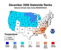
The 2008 annual temperature for the contiguous United States was near average, while the temperature for December was below the long-term average, based on records dating back to 1895, according to a preliminary analysis by scientists at NOAA’s National Climatic Data Center in Asheville, N.C..The Central and Southern regions experienced below-average temperatures, while above-average temperatures were felt in the West, Southwest and Northeast. This resulted in a near average annual temperature for the contiguous U.S. and the coolest annual temperature since 1997.
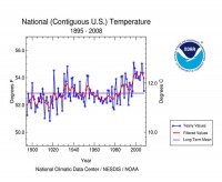
The average December 2008 temperature of 32.5 degrees F was 0.9 degree below the 20th Century average. December temperatures were much below average across the Upper Midwest and cooler than average across much of the West, Northwest and Midwest. Warmer-than- average temperatures were experienced in the Southeast and Mid-Atlantic States. The East North Central region (Iowa, Michigan, Minnesota, and Wisconsin) had its 10th coolest December on record. Respectively, Minnesota and North Dakota had their seventh and eighth coolest December.
Compare this to the October forecast we made for the winter based on a weak La Nina, low solar, a cold Pacific and the other factors at play. We are off to a good start and with this January cold, it should stay on target at least through this month.
By Joseph D’Aleo, CCM, AMS Fellow
Gavin Schmidt wrote a hit piece on Tuesday night’s the Lou Dobbs show that featured a discussion of global cooling. He objected that he was the sole voice on the side on global warming. He said the piece was not fair and balanced. To Gavin and the other alarmists, it appears, a piece that is fair and balanced can make no mention of any other opinion except that carbon dioxide is causing global warming and action is needed now and will deliver gain and no pain, something the one sided media coverage has gotten them used to over the years.
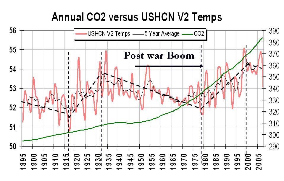
Yet there is considerable evidence that man is not responsible anything but local climate change through urbanization (the world’s population has grown from 1.5 to 6.5 billion people since 1900) and locally and regionally through land use changes like deforestation, forestation and irrigation. Consider for example United States temperatures cooled from the end of WWII in the 1940s to the late 1970s, warmed from 1979 to 1998 then leveled off and fell. That means 5 of the last 7 decades has seen cooling during the most rapid industrialization period, the post WWII boom. CO2 has increased the whole time. This does not give cause to believe CO2 is the primary climate driver as the alarmists want you to believe. We have shown you on this site many examples of how other factors like ENSO, the Pacific Decadal Oscillation, Atlantic Multidecadal Oscillation and cycles on the sun and volcanism are much better correlated with the observed temperatures than CO2 and are the real drivers.

In the Lou Dobbs’ segment, Ines Ferre, the reporter who did an excellent job talking to many scientists on both sides of the issue reported: “three independent research groups concluded that the average global temperature in 2008 was the ninth or tenth warmest since 1850, but also since the coldest since the turn of the 21st century.” Lou also noted that according to NOAA 7 of the 8 warmest years on record have occurred since 2001. Lou asked me if I quibbled with that data. I replied:
“Yes, I do. In fact, if you look at the satellite data, which is the most reliable data, the best coverage of the globe, 2008 was the 14th coldest in 30 years. That doesn’t jive with the tenth warmest in 159 years in the Hadley data set or 113 or 114 years in the NOAA data set. Those global data sets are contaminated by the fact that two-thirds of the globe’s stations dropped out in 1990. Most of them rural and they performed no urban adjustment. And, Lou, you know, and the people in your studio know that if they live in the suburbs of New York City, it’s a lot colder in rural areas than in the city. Now we have more urban effect in those numbers reflecting - that show up in that enhanced or exaggerated warming in the global data set.”
Gavin took umbrage at this slap at the data centers:
“D’Aleo is misdirecting through his teeth here. He knows that the satellite analyses have more variability over ENSO cycles than the surface records, he also knows that urban heat island effects are corrected for in the surface records, and he also knows that this doesn’t effect ocean temperatures, and that the station dropping out doesn’t affect the trends at all (you can do the same analysis with only stations that remained and it makes no difference). Pure disinformation.”
Really Gavin? Lets take a look. Ironically just this week we featured a story highlighting that exact issue and the discrepancy that exists between the satellite data and the surface based station statistics. But let’s start from the beginning. See the full response here.
By Craig Idso on CO2Science and SPPI
One of the long-recognized potential consequences of the ongoing rise in the air’s CO2 content is CO2-induced global warming, which has been predicted to pose a number of problems for both natural and managed ecosystems in the years ahead. Of newer concern, in this regard, are the effects that the ongoing rise in the air’s CO2 content may have on coral reefs. It has been suggested, for example, that CO2-induced global warming will do great damage to corals by magnifying the intensity, frequency, and duration of a number of environmental stresses to which they are exposed. The predicted consequences of such phenomena include ever more cases of coral disease, bleaching, and death.
Increases in the atmosphere’s CO2 content have also been postulated to possess the potential to harm coral reefs directly. By inducing changes in ocean water chemistry that can lead to reductions in the calcium carbonate saturation state of seawater, it has been predicted that elevated levels of atmospheric CO2 may reduce rates of coral calcification, possibly leading to slower-growing - and, therefore, weaker - coral skeletons, and in some cases, death.
Because of these many concerns, and the logical desire of individuals and governments to do something about what they perceive to be bona fide threats to the well-being of the biosphere, it is important to have a correct understanding of the scientific basis for the potential problems that have been predicted. Hence, in the following pages we review the scientific literature on CO2, global warming and coral reefs, in an effort to determine if the ongoing rise in the air’s CO2 content does indeed pose a threat to these incomparable underwater ecosystems. The key findings of this review are as follows:
There is no simple linkage between high temperatures and coral bleaching.
As living entities, corals are not only acted upon by the various elements of their environment, they also react or respond to them. And when changes in environmental factors pose a challenge to their continued existence, they sometimes take major defensive or adaptive actions to insure their survival.
A particularly ingenious way by which almost any adaptive response to any type of environmental stress may be enhanced in the face of the occurrence of that stress would be to replace the zooxanthellae expelled by the coral host during a stress-induced bleaching episode by one or more varieties of zooxanthellae that are more tolerant of the stress that caused the bleaching.
The persistence of coral reefs through geologic time - when temperatures were as much as 10-15C warmer than at present, and atmospheric CO2 concentrations were 2 to 7 times higher than they are currently - provides substantive evidence that these marine entities can successfully adapt to a dramatically changing global environment. Thus, the recent die-off of many corals cannot be due solely, or even mostly, to global warming or the modest rise in atmospheric CO2 concentration over the course of the Industrial Revolution.
The 18- to 59-cm warming-induced sea level rise that is predicted for the coming century by the IPCC - which could be greatly exaggerated if predictions of CO2-induced global warming are wrong - falls well within the range (2 to 6 mm per year) of typical coral vertical extension rates, which exhibited a modal value of 7 to 8 mm per year during the Holocene and can be more than double that value in certain branching corals. Rising sea levels should therefore present no difficulties for coral reefs. In fact, rising sea levels may actually have a positive effect on reefs, permitting increased coral growth in areas that have already reached the upward limit imposed by current sea levels.
The rising CO2 content of the atmosphere may induce changes in ocean chemistry (pH) that could slightly reduce coral calcification rates; but potential positive effects of hydrospheric CO2 enrichment may more than compensate for this modest negative phenomenon.
Theoretical predictions indicate that coral calcification rates should decline as a result of increasing atmospheric CO2 concentrations by as much as 40% by 2100. However, real-world observations indicate that elevated CO2 and elevated temperatures are having just the opposite effect.
In light of the above observations, and in conjunction with all of the material presented in this review, it is clear that climate-alarmist claims of impending marine species extinctions due to increases in both temperature and atmospheric CO2 concentration are not only not supported by real-world evidence, they are actually refuted by it. Read the full detailed report here.
See also this CO2 Science video “CO2, How Sweet It Is...for Sugarcane” showing more CO2 would have benefits for crops like Sugarcane below.
Larger movie here.
By Joseph D’Aleo, CCM, AMS Fellow
2008 ranked 14th coldest of the thirty years of records for the University of Alabama MSU based lower tropospheric temperatures (right in the middle of the pack). It was the coldest year since 2000. It continues the downtrend of the last 7 years. This compares with the Hadley Center data which (together with the equally alarmist WMO) claims 2008 will rank 10th warmest since 1850. (159 years!). How can an “average year” in one data base appear be a “top 6%” warmest year in another?
Well the global data bases of NOAA GHCN, NASA GISS and Hadley CRUT3v are all contaminated by urbanization, major station dropout, missing data, bad siting, instruments with known warm biases being introduced without adjustment and black box and man made adjustments designed to maximize warming (Steve McIntyre found more urban areas had their temperatures adjusted up then down). Also ocean temperatures are an issue with a change in the methods of measurement and incomplete coverage. Hadley uses their own merchant ship data and that covers some heavily travelled routes but has no coverage of the vast southern oceans (the oceans cover 70% of the world’s surface).
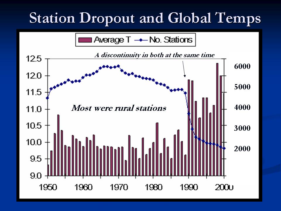
The biggest issue is station dropout. 2/3rds of the world’s stations, many rural areas in the FSU stopped reporting around 1990. Dr. Kenji Matsuura and Dr. Cort J. Willmott at the University of Delaware prepared this animation. See the lights go out in 1990. The below plot of the NOAA/NASA station count (blue line) and average annual temperatures (brown columns). It clearly shows the big dropoff of rural stations. The animation above shows that Siberia is one area with the biggest change.
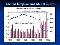
See larger image here.
Average temperatures for the station categories jumped when the stations dropped out, suggesting that it was mainly the colder stations that were no longer in the record. The global data bases all set up grid boxes globally and populate the temperatures for the box using data from within that box or now with many empty boxes using the closest stations weighted by distance in nearby boxes. Thus a box which had rural stations, will find temperatures now determined by urban areas in that box or distant boxes. This is why the global data bases suggest the greatest warming has been in Siberia.
Also a factor is that in the FSU era, the cities and towns temperatures determined allocations of funds and fuel, so it is believed that the cold was exaggerated in the past introducing an artificial warming. See the details of these numerous data integrity issues here.
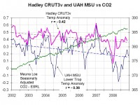
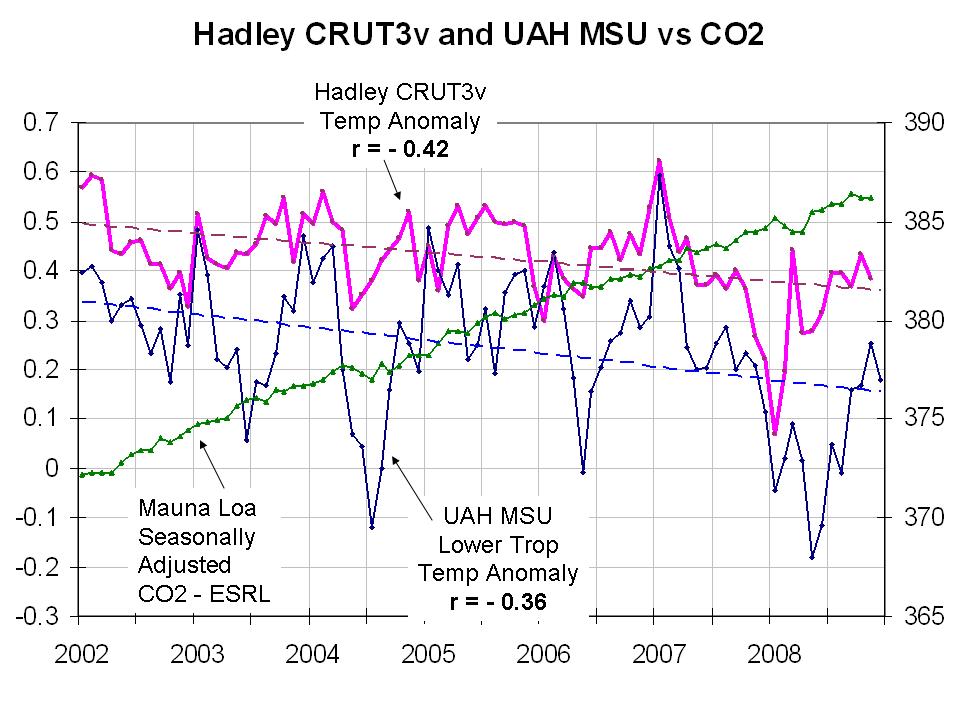
The Hadley monthly and UAH MSU monthly lower tropospheric temperatures are shown. Both show cooling (0.2C (0.3F)) for MSU and (0.15C (0.25F)) for Hadley. Note the significant NEGATIVE correlation of temperatures with CO2.
See larger image here.
Anomaly differences come from the base period to compare to and compute anomalies. The Hadley used 1960 to 1990 and the satellite centers 1979-1998. Satellite microwave sensing is not subject to any of these problems and provides full global coverage. It integrates local warming due to urbanization. It is as a result is the most reliable and trustworthy. Unfortunately the data extends only back to 1979. Nonetheless, you can use the above to conclude this past year was not the 10th warmest year as the alarmists are claiming. Read more here.
And just wait for the next few weeks in the United States and southern Canada. Would you believe 0F or below even in some big eastern cities and plenty of snow? Frost or freeze into Florida and hundreds of records will tumble in the south. (PREDICTION: First sub-zero day Friday in New York City since 1994). This will help start 2009 on a cold note like 2008. The UKMO which hasn’t got it right in a generation already are calling for a top 5 warmest year.
These issues also address the ridiculous claims and logic in this post.